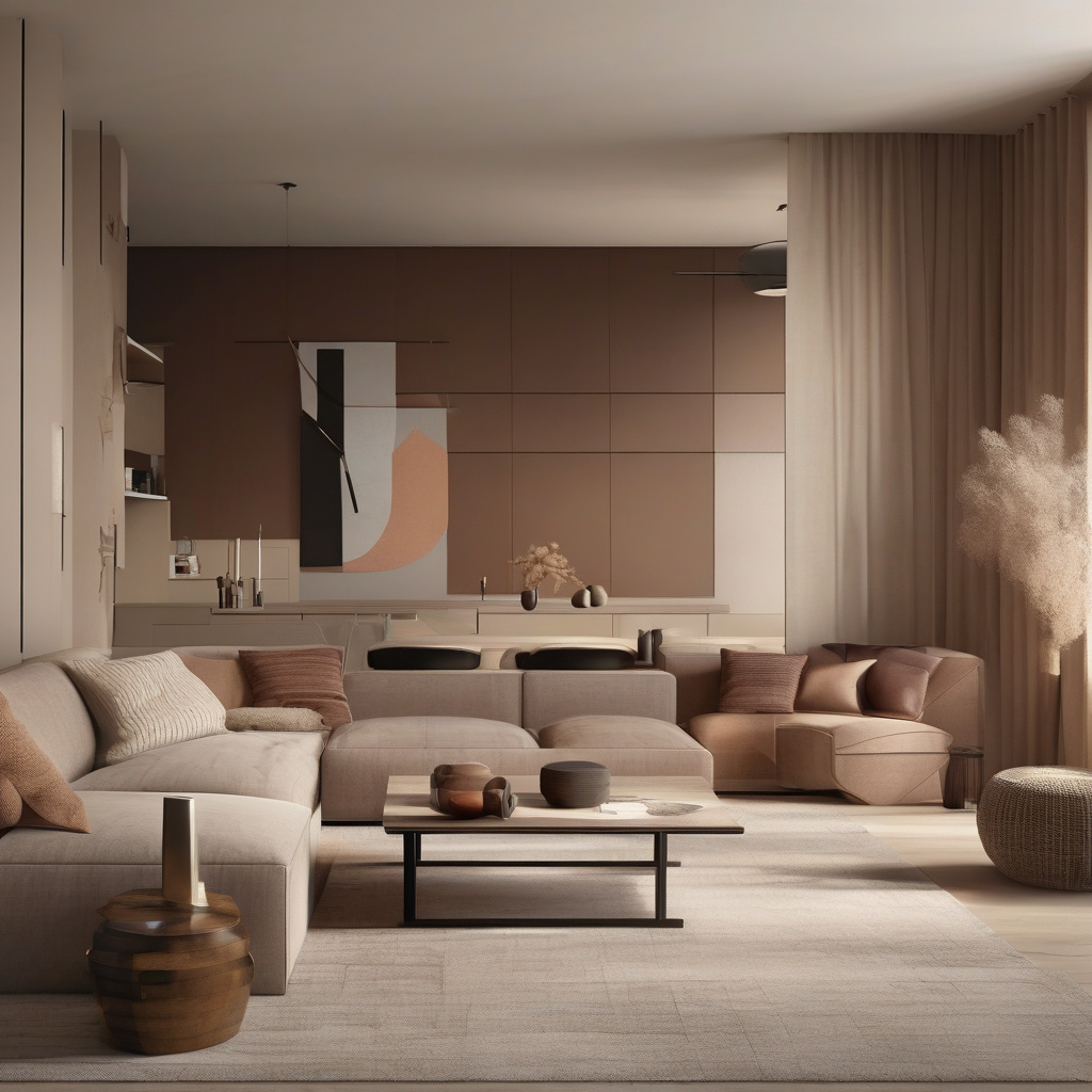
Color blocking is not just a trend; it’s a revolution in the realm of interior design. Born out of the art world, this technique uses crisp geometric shapes and contrasting colors to transform an otherwise bland space into an energetic and contemporary masterpiece. In Los Angeles, where the sun casts a unique light over every surface, color blocking finds a special resonance. Homeowners and designers alike are turning to this method to bring life and character to interiors while keeping an eye on the avant-garde.
Brief summary: Color blocking in modern interiors harnesses geometric shapes and contrasting colors to invigorate rooms without overwhelming them. This technique is increasingly popular in Los Angeles, offering both aesthetic appeal and practical benefits in home renovation projects. The article explores costs, methods, and homeowner experiences in adopting this vibrant style.
The Rise of Color Blocking in Los Angeles Interiors
Los Angeles is a city that thrives on innovation, and its residents are no strangers to pushing the boundaries of conventional design. Enthusiasm for color blocking has grown substantially here, with urbanites eager to imprint their individuality on their living spaces. As the technique involves bold choices, it aligns perfectly with the spirit of a city accustomed to reinvention.
Color blocking in Los Angeles homes often draws inspiration from the city’s vibrant arts scene, making an ordinary room feel like a personal art gallery. This approach to interior painting can also be a clever way for homeowners to manage costs while achieving dramatic change. For additional details on transforming interiors with paint, you can explore colorful painting methods for interiors.
Strategically placed color blocks can manipulate perception, making spaces appear larger or more dynamic. For instance, a well-executed diagonal line can add depth or height, turning a previously drab area into a focal point. Homeowners employing this technique often discover new dimensions to their living spaces, reinvigorating their appreciation for their environments.
As many locals now notice, the advent of color blocking is more than a mere aesthetic shift; it’s a conversation starter. A visitor to a home might find themselves captivated by how colors intersect or how shapes complement or contrast with existing furniture. This interactive element is why color blocking continues to gain traction among Angelenos looking for a fresh edge.
In conclusion, the rise of color blocking in LA interiors speaks to a growing desire among residents to break free from traditional design norms, embracing creativity and self-expression in every square inch of their homes.
Understanding the Core Principles of Color Blocking
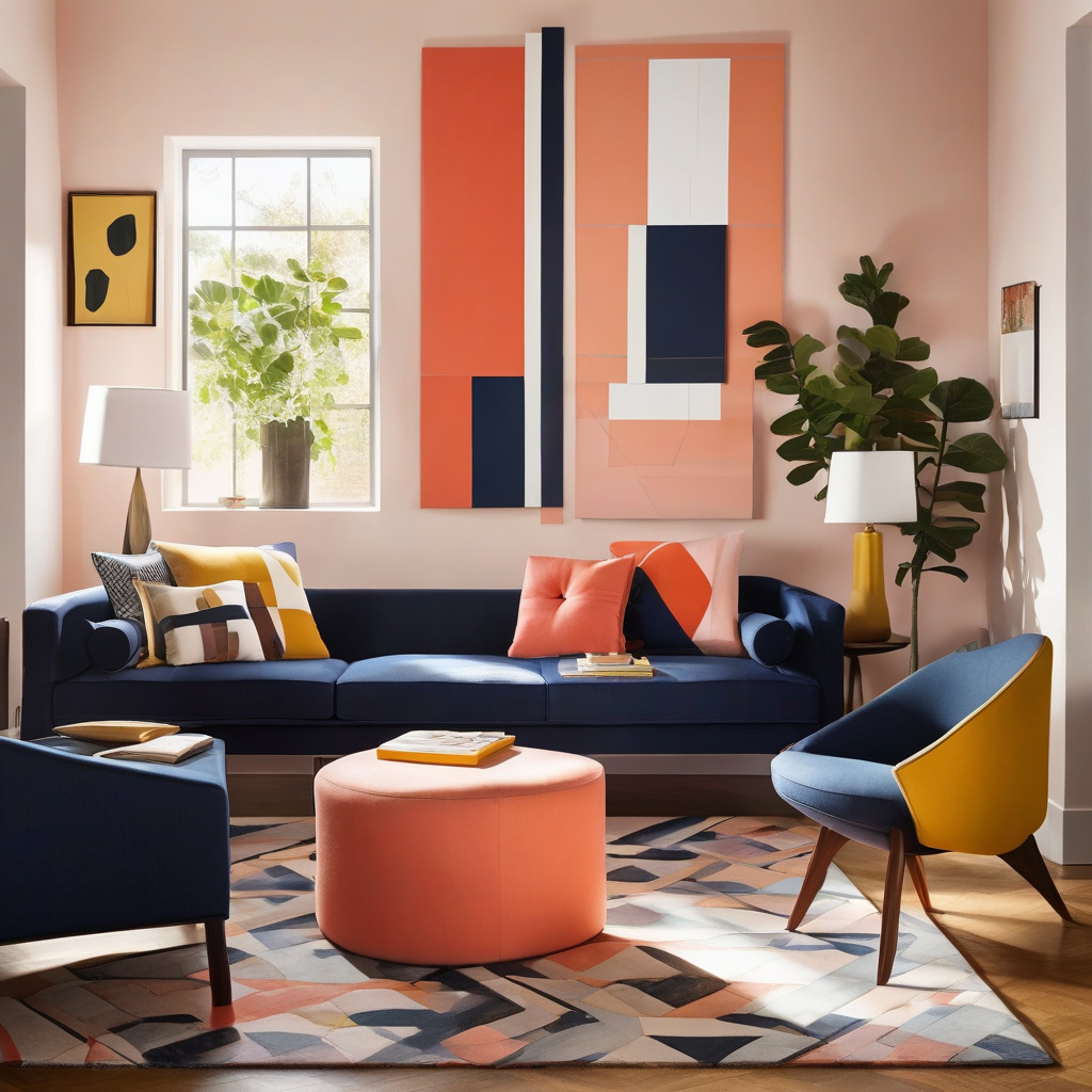
Color blocking is about balance and boldness, combining contrasting hues in structured segments to craft an architectural statement. It’s a technique that owes its roots to modern art movements, translating them into spaces where daily life unfolds. Developers and architects often engage with this design strategy to captivate prospective buyers or renters.
Consider the need for a focused approach to color selection. The palette should not only represent the personality of those inhabiting the space but also complement other design elements such as furniture and lighting. Instead of a chaotic juxtaposition of shades, successful color blocking relies on carefully chosen hues that contrast yet cohesively interact.
For a home undergoing renovation, the process might begin with a color wheel—deciding which colors will anchor the room and which will serve as accents. This preparatory step can prevent costly mistakes, saving on materials and time. Effective planning is crucial, as impulsive decisions can lead to a discordant environment.
To delve deeper into the nuances of finishes, comparing faux and flat finishes can clarify how best to implement color patterns and textures for maximum effect.
Ultimately, the principles of color blocking depend on a harmony between daring choices and subtlety, creating spaces that are both stimulating and serene.
Implementing Color Blocking: A Step-by-Step Guide
Beginning a color blocking project requires both vision and a strategic approach. Here’s how to ensure a streamlined process:
- Assess the Room: Analyze lighting, existing décor, and architectural features.
- Choose a Palette: Select a few bold colors that harmonize with the overall theme.
- Plan the Layout: Sketch potential designs, experimenting with different geometric shapes.
- Sample and Test: Apply small test patches to evaluate color interactions.
- Execute: Begin the painting process, ensuring clean lines and sharp contrasts.
Following these structured steps, many homeowners have found success in integrating color blocking into their living environments effortlessly.
The Materials Matter: Choosing the Right Products
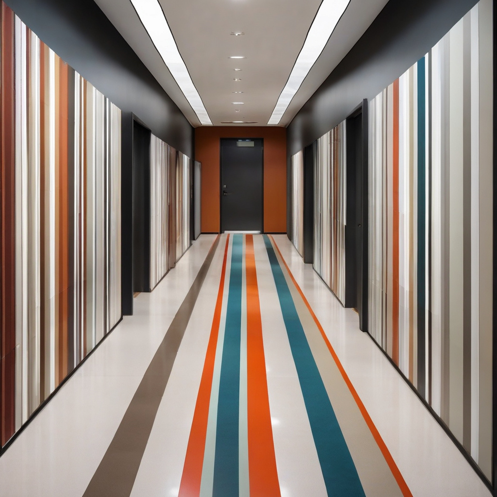
The materials chosen for a color blocking project play a critical role in the outcome of the design. High-quality paints ensure durability and vibrancy, crucial in a city like Los Angeles where rooms are flooded with natural light. Selecting the right type of paint—be it matte, glossy, or textured—can affect how each color is perceived.
In addition to paint selection, the tools used are equally important. High-grade brushes and painter’s tape are vital for achieving clean edges and crisp lines. Some designers prefer using stencils for more intricate patterns, adding a new layer of sophistication to the design.
Different homes require different approaches. For instance, wall materials—whether drywall or plaster—can influence the type of primer or finishing coat needed. Comprehensive insights about complementary trim and door colors can further enhance the appeal of chosen shades.
Ultimately, having the right combination of materials lays the foundation for a successful color-blocking project, merging aesthetics with functional quality.
Therefore, choosing the right products is as much about potential as it is about precision, ensuring striking, lasting results.
Balancing Costs: Investment vs. Return
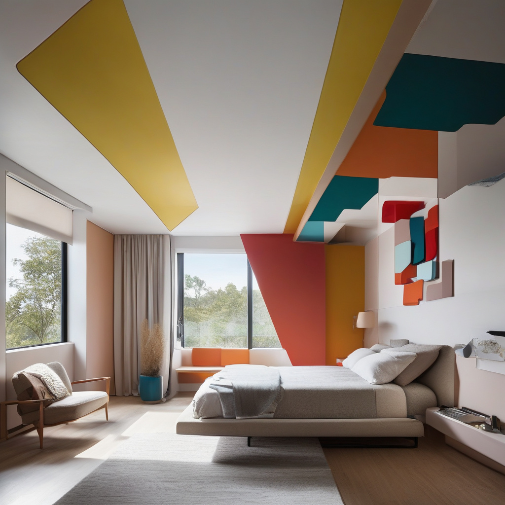
Beyond its aesthetic allure, color blocking offers significant return on investment, particularly in an area like Southern California, where design-conscious buyers dominate the property market. While some may view it as an indulgent expense, its potential to boost property value can outweigh the initial costs.
Design experts note that for a typical room, expenses can range from $1,000 to $3,000 depending on size, paint quality, and complexity of design. However, the impact on market appeal is often substantial. Color blocking has the power to make a property stand out in listings, increasing foot traffic and reducing time on the market.
“A National Association of Realtors study found that homes with professionally staged interiors—often utilizing techniques like color blocking—sold for 25% more compared to those without.”
First-time renovators are advised to consult with professional designers to explore various aesthetic possibilities and ensure that their homes genuinely benefit from the enhancements.
Balancing these factors carefully positions color blocking as both an investment in personal satisfaction and a strategic financial decision.
Creating Impact: Risks and Rewards
Every design choice comes with its share of risks and potential rewards. Color blocking, when poorly executed, can overwhelm a space, leaving it feeling chaotic rather than harmonious. The key is careful planning and a focus on quality execution.
Conversely, when done correctly, the rewards are manifold—a home that radiates modern sophistication, a unique personal stamp that reflects the inhabitant’s tastes, and ultimately, a space that invites conversation and admiration.
Homeowners who embrace these decisions with thoughtful consideration often find that the benefits far outweigh the initial hesitations.
Expert Insights: How to Maximize Your Space with Color
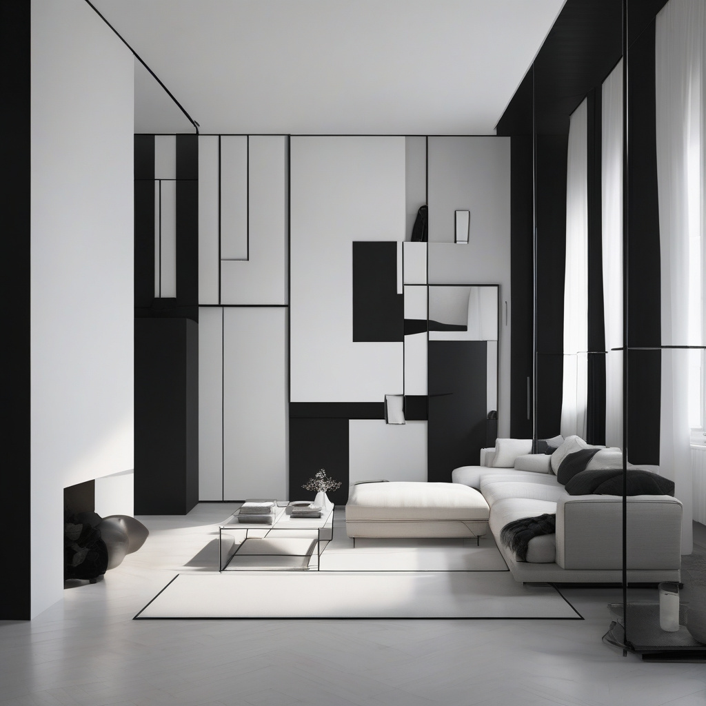
Color blocking effectively expands visual space, tricking the eye into seeing larger, more open areas. Experts recommend using lighter colors in smaller rooms to create an airy feel, while darker hues can highlight architectural features or create cozy nooks.
“Top designers suggest that well-executed color blocking can make a ceiling appear over a foot higher, dramatically transforming a room’s ambiance and functionality.”
Additional advice includes leveraging natural light to emphasize the impact of color blocks. Large windows and higher ceilings interact with bold colors in captivating ways, enhancing the sense of space.
Designers often employ techniques such as continuity—using the same color palette in adjacent rooms to maintain flow, further accentuating openness. To explore additional structural influences like vaulted ceiling choices, resources are available that delve deeper into these intricate decisions.
Color blocking, when used judiciously, not only refreshes but redefines a home’s interior, making it a powerful tool in the homeowner’s arsenal.
The Future of Color Blocking in Home Design
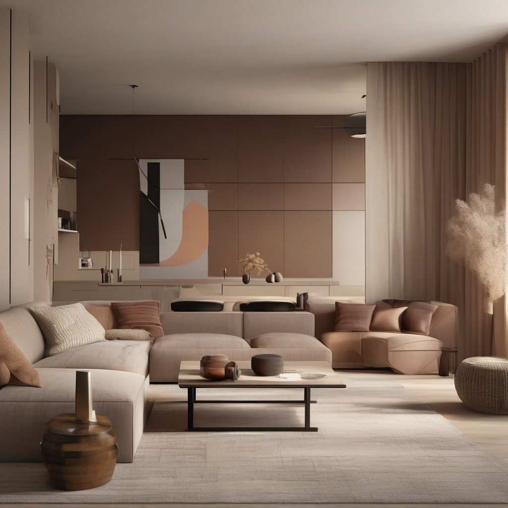
Looking to the future, the role of color blocking in interior design seems set to expand. As design technology evolves, we’re likely to see even more innovative uses of this technique, integrating smart technology with traditional aesthetics.
The emergence of eco-friendly paints and the increasing availability of vibrant pigments and finishes provide endless possibilities for homeowners and designers alike. Upcoming trends may include interactive walls, dynamic shades, and sustainable solutions, all rooted in color-block foundations.
“A report by the Design Council predicts a surge in sustainable materials that will redefine modern interiors, with color blocking playing a crucial role in both aesthetic and environmental design aspirations.”
The key to staying ahead lies in embracing the changes while maintaining an eye on timeless elegance. As many Los Angeles homes undergo transformation, the adaptability of color blocking ensures its enduring relevance.
In conclusion, color blocking promises an exciting frontier for interior design, providing the perfect platform for individual expression and sophisticated style in our homes.
- Color blocking offers a dynamic way to enhance modern interiors with clean geometry and vibrant hues.
- It is a cost-effective technique that resonates with Los Angeles’ ethos, adding market value to homes.
- The use of quality materials and expert execution ensures stunning, lasting impacts on living spaces.
- With proper planning, color blocking can maximize space, increasing perceived room dimensions.
“`html
FAQ
What is color blocking in modern interior design?
Color blocking in modern interior design involves the use of bold, contrasting colors arranged in clean geometric patterns to create visual interest and define a space. In practice, this often translates to a vibrant yet controlled atmosphere in homes, where carefully selected hues highlight unique architectural features or draw attention to specific areas within a room. Color blocking serves as a dynamic alternative to monochromatic or more traditional decor, allowing homeowners to express personality and creativity without overshadowing the overall design harmony. Experienced renovators understand that successful color blocking requires a keen eye for balance; too much contrast can overwhelm, while too little may fail to make an impact.
How do I choose the right colors for blocking in my home?
Choosing the right colors for blocking involves considering the existing color palette of your home, the mood you want to create, and the architectural elements you wish to emphasize. Many experts recommend starting with a color wheel to identify combinations that provide sufficient contrast while maintaining a cohesive look. For instance, pairing complementary colors like blue and orange or analogous shades like green and blue can yield appealing results. In real renovation projects, homeowners often find it helpful to test swatches on walls to observe how lighting conditions throughout the day affect the appearance of colors. Don’t forget to consider the flooring, furniture, and other permanent fixtures to ensure the overall look comes together seamlessly.
When does it make sense to use color blocking in a home?
In residences with open-concept living spaces, color blocking can be particularly beneficial. It helps to define distinct zones—like separating a living room from a dining area—without the need for physical barriers. Color blocking is also advantageous in older properties undergoing renovation, where you might want to draw attention away from less attractive architectural details or inject a sense of contemporary flair. A freshly painted bold accent wall or a strategically colored niche can transform an otherwise nondescript area into a focal point. It’s crucial, however, to carefully plan placements so the colors communicate harmony rather than discord.
What common mistakes should be avoided in color blocking?
Homeowners frequently underestimate the power of testing colors before committing to a full design. A common error includes selecting shades that compete instead of complementing the existing interior features. Another mistake is neglecting the influence of lighting; a color that appears vibrant under natural daylight may look dull in artificial lighting. Additionally, failing to integrate color blocking with the overall design theme can result in a disjointed home aesthetic. Careful planning, including consultation with design professionals when necessary, helps bypass these pitfalls and ensures a harmonious and effective color block application.
What are the cost considerations for implementing color blocking?
In terms of expense, the cost of color blocking largely depends on the scope of work and the quality of materials chosen. Premium paints in unique hues can increase costs, while the scale of the project—whether a single accent wall or multiple rooms—also plays a significant role. Homeowners should budget for potential professional fees if employing an interior designer or color consultant. It’s often effective to contrast this expense with the transformative potential of color blocking—a relatively affordable method compared to structural renovations, yet capable of delivering a significant visual impact. For a customized quote and professional guidance, reaching out for expert advice can be invaluable.
What are the pros and cons of color blocking in interiors?
Color blocking in interiors offers numerous advantages, including the ability to inject energy, create visual separation in open spaces, and highlight architectural details. It’s a versatile technique that adapts well to both small and large areas, allowing personalization with color choices. However, there are challenges—overuse or inappropriate color pairings can result in an overwhelming environment. The maintenance of vibrant colors, particularly in sunlight-exposed areas, may also require more frequent touch-ups. The success of this approach often hinges on precise execution, making professional advice advantageous. Contact experienced renovation experts if you seek tailored insights for your project.
How do installation specifics affect the outcome of color blocking?
The installation of color blocking requires precision to ensure clean lines and effective contrast. Failure to prepare surfaces properly can lead to uneven applications that detract from the overall impact. Professionals often use painter’s tape and high-quality brushes or rollers to achieve precise edges. In some cases, multiple coats are necessary for an even, vibrant finish, especially if the underlying color is significantly different. Installation nuances such as these demonstrate that preparation and execution are as crucial as color selection itself. Homeowners may want to consider engaging with specialists for complex designs to achieve optimal results.
How can I maintain the look of color-blocked walls over time?
Maintaining the appearance of color-blocked walls involves regular cleaning and occasional touch-ups as necessary. Dust and dirt can dull the vividness of the paint, so gently wiping walls with a damp cloth can help retain their brightness. In homes with high traffic areas, inevitable scuffs can be remedied by keeping extra paint on hand for touch-ups. Additionally, homeowners should be cautious about sun exposure; UV rays may cause colors to fade over time, so using UV-protective window treatments can preserve the luster. By routinely evaluating the condition of your walls and acting promptly on minor repairs, you can sustain the fresh, modern look that color blocking encapsulates in your home.
“`