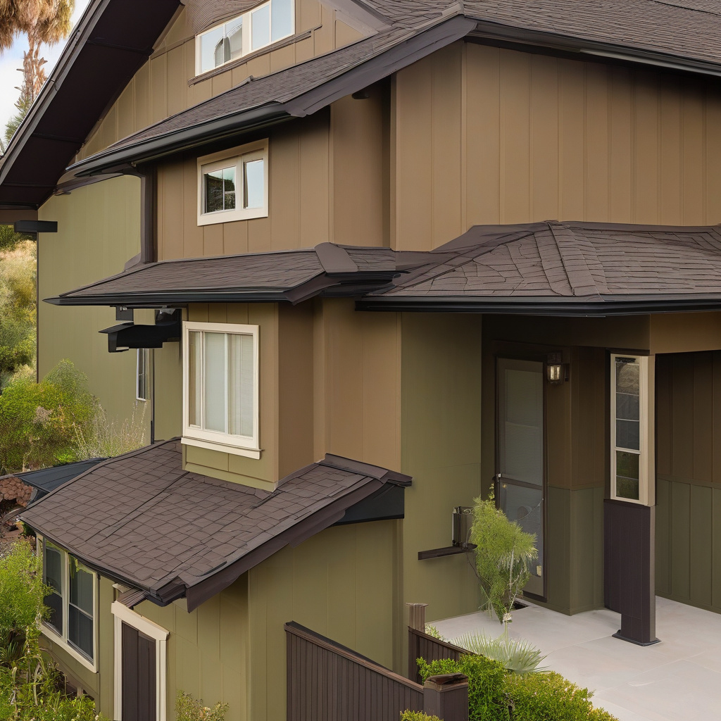
Imagine standing curbside and gazing at your home—a sanctuary that tells a story through colors and design. For many homeowners in Los Angeles and Southern California, selecting paint colors that pair seamlessly with their existing roof hues is a crucial design decision. This task requires a balance between undertone harmony and contrasting elements to deliver a curb appeal that feels both intentional and cohesive.
Brief summary: This article explores strategies for pairing exterior paint colors with existing roof colors to enhance curb appeal in Southern California homes. It includes practical examples, expert insights, and comparisons of renovation options alongside relevant considerations for homeowners.
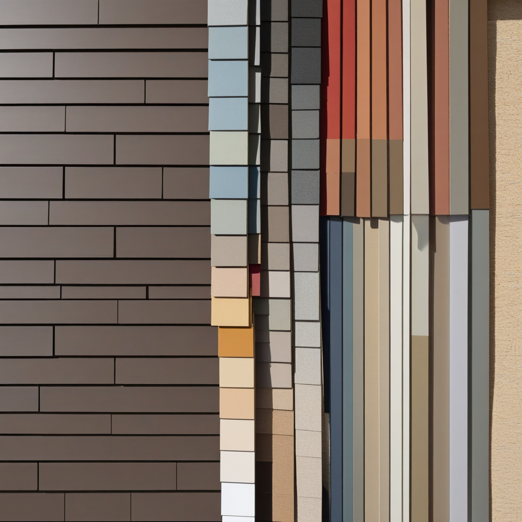
The Aesthetic Alchemy of Roof and Paint
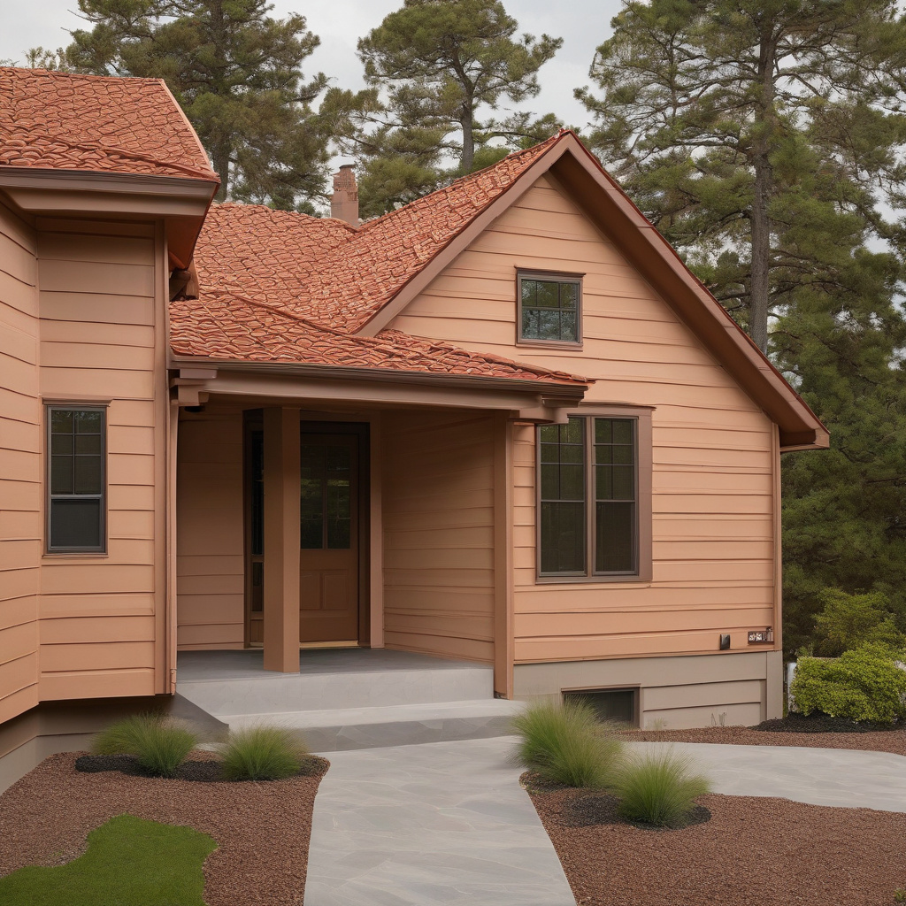
In the world of home design, color can either be your friend or your silent adversary. The magic often lies in marrying existing elements—like your roof—with new paint choices to create a truly harmonious exterior. For instance, consider a typical Spanish-style abode, its terra cotta shingles casting a warm, earthy overtone. Reimagining this canvas with a palette of soft desert sands or muted sage greens can echo the natural Californian landscape, blending modern aesthetics with authentic charm.
Many homeowners find themselves torn between playing it safe with neutral shades and experimenting with bolder hues. A seasoned renovation expert might suggest looking not just at your roof’s color, but at its material and texture as well. Slate roofs, with their dark, cool tones, could elegantly pair with crisp whites or pale blues, adding a coastal flair fit for Pacific breezes.
According to insights from local renovation guides, shifting your perspective from merely matching colors to crafting a complementary story enhances curb appeal and adds to the home’s allure. This decision-making process is less about what looks good in isolation and more about contributing to a larger visual narrative.
Color decisions are far-reaching, impacting not only immediate aesthetics but long-term satisfaction. A thoughtful palette can balance traditional features while accommodating personal style, ultimately creating a welcoming facade reminiscent of sunny Californian optimism.
In summary, thoughtful color coordination redefines spaces, transforming ordinary homes into extraordinary cultural statements.
Navigating the Color Wheel: Planning Your Palette
Planning your exterior paint starts with the basics: understanding the color wheel. Warm roofs featuring shades such as red or brown often find harmony with equally warm palettes, though contrasting cool hues like navy or forest green can offer a striking visual intrigue. When thoughtfully coordinated, these choices harmonize a home’s overall aesthetic, making it visually appealing while embodying its architectural integrity.
Los Angeles homeowners face unique challenges when balancing visual appeal with regulatory concerns and community guidelines. Many local neighborhoods pride themselves on distinct cultural heritage, often favoring paint schemes that echo historic roots. Thus, a balance is crucial between homage to tradition and embracing modern tastes.
The process involves examining color samples in different lighting, a crucial step as many Southern Californian homes experience varied lighting conditions throughout the day. It’s about more than selecting colors—it’s about creating a living work of art reflective of both personal tastes and the area’s iconic style.
For those with open-plan layouts, the concept of color flow and continuity throughout spaces ensures not only outdoor elegance but also indoor harmony. Strategizing paint colors to flow seamlessly from exterior walls to interior cores exemplifies sophisticated planning.
The strategic use of contrasting hues and thoughtfully curated palettes can maintain aesthetic unity, conveying a refined yet welcoming residence.
Balancing Costs and Creativity
Embarking on an exterior repainting venture without considering budget constraints is an adventure in wishful thinking. Whether it’s a tight remodel or a luxurious upgrade, costs often weigh heavily on homeowners’ shoulders. However, investing thoughtfully can yield substantial long-term benefits, like enhanced property values and aesthetic satisfaction.
The cost variable can be influenced by numerous factors, including the quality of paint and professional labor. Homeowners are strongly advised to consider the durability and warranty of materials before finalizing their purchases. High-quality paints with longer-lasting finishes may carry higher upfront costs but offer extended protection, saving on future maintenance.
Additionally, homeowners often encounter unexpected expenses like surface preparation and repair needs. With Southern California’s climate boasting both sun and salt-laden air, preparing these surfaces correctly is critical.
When weighing the financial aspects of redesigning a home’s exterior, consulting cost analyses helps align expectations accurately. Comparing various paint and production expenses is essential to developing a realistic, achievable budget.
The financial investment in quality materials and thoughtful design choices not only enhances the immediate visual appeal but also preserves and elevates the home’s market value.
Expert insight: “An investment in premium paint can extend the life of a project, providing up to 50% longer protection than lower-quality materials.” — Southern California Construction Association
Drawbacks and Benefits: Taking the Leap
With any renovation, there come both advantages and disadvantages, risks interlaced with rewards. Understanding this interplay can guide homeowners in making informed decisions about their plans.
Advantages to exterior painting include improved curb appeal, increased property value, and potentially better homeowner satisfaction. Complementary color schemes enhance aesthetic stability and indicate attentive ownership, pivotal in property markets such as Los Angeles.
On the other hand, the disadvantages largely stem from misunderstandings about color trends, weather impacts, and personal tastes. Bold choices might attract or repel prospective buyers, and some textures might not lend themselves well to certain paint types.
In neighborhoods rich with character, selecting colors that disrupt the coherence of historical aesthetics might not be well-received. It requires balancing individual preferences with community standards.
Being aware of these pros and cons, while navigating through the complexities of a comprehensive paint project, arms Southern Californian homeowners with the knowledge to make choices befitting their property’s unique character.
Research observation: “Homes with well-coordinated exterior colors tend to sell over three times faster than those with mismatched or stark paints.” — Real Estate Market Trends Report
- Improved marketability and visual appeal
- Potentially expensive upfront investments
- Need for alignment with community aesthetic guidelines
- Consideration of local weather conditions
Step-by-Step Palette Perfection: A Mini How-To Guide
Crafting a perfect color palette is less a matter of chance and more an exercise in methodical evaluation. Here’s how homeowners can ensure their visions become reality:
Step 1: Assess Influences – Examine existing features such as roof tones, landscaping, and neighborhood styles for inspiration and constraints.
Step 2: Sample Galore – Equip yourself with color swatches, applying samples in various locations under different lighting to catch unanticipated undertones.
Step 3: Consult the Professionals – Seek advice from color experts or hire experienced painters familiar with Southern California’s unique challenges.
Step 4: Prototype Refresh – Mock-up potential palettes with digital design tools, avoiding costly mistakes and confirming your color choice on screen before physical application.
Through these methodical steps, achieving a cohesive exterior aesthetic is within reach, manifesting your home’s distinct identity.
Resources and Professionals
Leaning on professional expertise can provide invaluable reassurance, ensuring each project stage is executed to perfection. Collaborating with knowledgeable designers can avert color disasters, boost project efficiency, and secure lasting returns.
Accent and Accessorize: Emphasizing Details
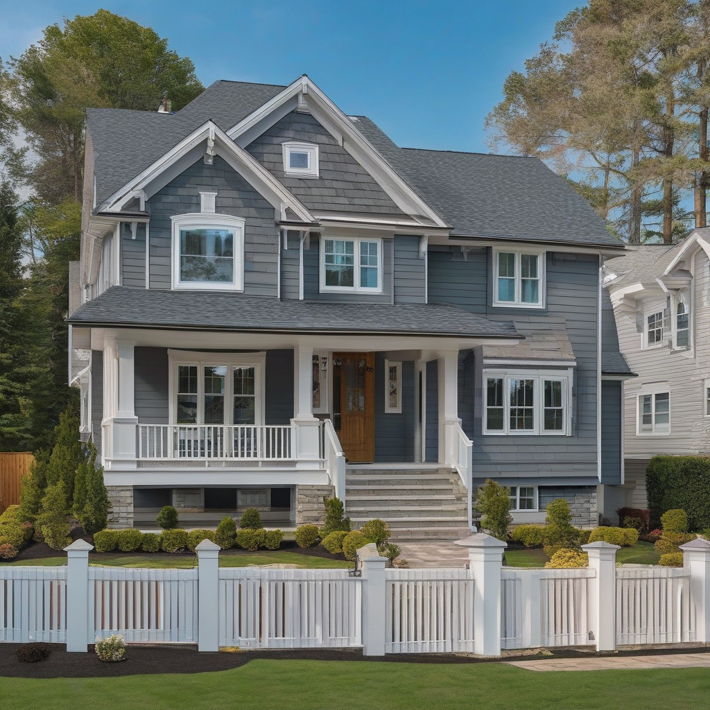
The final touches in a home renovation project often carry the heaviest weight in defining its ultimate spirit. Once the primary color palette is established, selecting accents such as front doors, shutters, and trims further enhances the character of the facade.
Introducing a bold, inviting color as a focal point can create a captivating feature that draws the eye, offering visitors a taste of the home’s character. Evoking enchantment, doors painted in shades of bright red or classic black may convey a sense of elegance or modernity.
While pondering these decisions, take the opportunity to learn more about utilizing innovative focal points that complement your main color scheme, adding sophistication and depth.
The power of accentuation lies within its ability to highlight unique architectural features, showcasing individuality without overshadowing the cohesiveness of the broader ensemble.
Finally, ensure that the chosen accents resonate throughout the property, creating an inviting entrance and extending the thematic flow into the interior spaces.
Industry statistic: “Nearly 80% of potential buyers form their first impression by simply observing the front door.” — Home Entrance Design Survey
Table of Options: Cost and Aesthetic Breakdown
| Paint Option | Average Cost | Durability | Aesthetic Appeal |
|---|---|---|---|
| Eco-Friendly Acrylic | $4,000 – $6,000 | High | Modern & Versatile |
| Traditional Oil-Based | $3,000 – $5,000 | Moderate | Classic & Rich |
| Silicone-Based Sealant | $5,000 – $8,000 | Very High | Sleek & Durable |
- Select colors that complement your existing roof for cohesive curb appeal.
- Factor in local lighting and personal preferences when choosing paint.
- Consider both the aesthetic value and cost-benefits of quality materials.
- Consult with professionals and plan your palette thoughtfully.
- Use bold accents to emphasize unique home features and enhance allure.
“`html
FAQ
How do I determine the undertone of my roof color?
Understanding the undertone of your roof color can be a game-changer when selecting exterior paint. In real renovation projects, many homeowners are surprised to find that their roofs have hidden undertones, such as warm reds or cool blues, which aren’t immediately obvious. To identify these, you might compare small paint samples against the roof under natural lighting. Construction experts often recommend stepping back and observing from different angles. This natural evaluation prevents mismatches that only become evident once painting is complete.
What are some popular paint colors that pair well with dark roofs?
Dark roofs, common in many single-family homes, offer flexibility with paint choices. Many experts point out that colors like soft beige, light gray, or creamy whites create an appealing contrast without overwhelming the senses. For a bolder statement, muted greens work surprisingly well, adding depth without clashing. A frequent oversight, however, is choosing colors that make the home lose its inviting feel. Larger paint samples viewed at different times of the day can prevent such misalignments.
Why is color harmony so important in exterior paint selection?
Color harmony is crucial in ensuring your home’s exterior looks seamless and well-thought-out. In new builds, architects often emphasize the harmony between roof, siding, and trim, as it impacts curb appeal. Homeowners frequently underestimate how discordant colors can affect perception. One real-life observation: homes with cohesive palettes often receive higher offers. Testing colors together on large boards can give a better sense of harmony, ensuring the selections are cohesive before committing.
What is the best way to create contrast with existing roof colors?
Creating contrast can make your home stand out while remaining tasteful. Light paint colors paired with darker roofs can highlight architectural features and add visual interest. Conversely, deeper shades like navy or charcoal can significantly accentuate a home’s stature when paired with a lighter roof. Renovation experts recommend considering seasonal light changes, as natural light can drastically alter perceived contrasts. Observing potential color choices during different weather conditions is a savvy strategy.
Are there common mistakes homeowners make when matching paint with roof colors?
A typical mistake is overlooking the roof’s color tone subtleties and choosing paints that clash because of it. For instance, a roof with a warm undertone paired with a cool exterior color can feel jarring. Experts advocate for complementary colors to avoid such missteps. Another oversight is relying solely on computer-generated visualizations which often lack the nuance of natural lighting. Real-world testing, with large swatches viewed at different times of day, offers invaluable insights that digital tools can’t fully replicate.
What are some cost considerations in selecting exterior paint colors?
Cost is a crucial factor in exterior painting projects. Many homeowners face sticker shock because they haven’t accounted for high-quality paint brands or underestimated the quantity needed due to multiple coats. In California especially, choosing light colors can lead to energy savings by reflecting rather than absorbing heat. Consider ongoing maintenance costs too; certain colors show dirt more easily, requiring more frequent cleaning. Balancing upfront costs with long-term savings is typically sound advice. For personalized guidance, consider consulting experts through resources like this helpful contact form.
What are the pros and cons of painting light vs. dark exterior colors?
Light colors can make your home appear larger and more inviting, crucial for smaller lots in urban areas. They are energy efficient, reflecting sunlight and keeping interiors cooler. However, they may require more frequent cleaning. Dark colors can give a dramatic and sophisticated look, camouflaging minor imperfections on older properties. But they tend to absorb heat and can fade faster. Weighing these factors is essential: consider climate, home size, and neighborhood aesthetic standards before deciding.
How often should exteriors be repainted, considering roof color influences?
The frequency of repainting depends on climate, paint quality, and maintenance routines. Typically, homes need a fresh coat every 5-10 years. However, dark colors near lighter roofs might show more wear and fade faster due to sun exposure. Homeowners often neglect regular cleanings that can extend paint life. In renovation circles, routine assessments of paint condition, especially post-seasonal changes, are considered best practice. By staying attentive, homeowners can maintain both aesthetic appeal and structural integrity.
“`