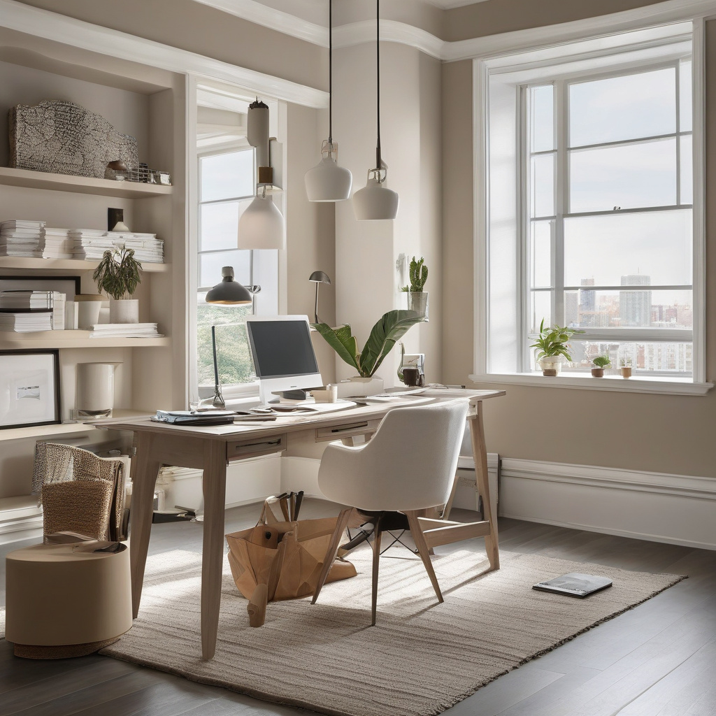
The concept of a home office has evolved dramatically over the years, particularly in the wake of increased remote work and the ubiquity of video conferencing tools like Zoom. In the sun-drenched corners of Los Angeles and Southern California, creating a home office that is not only functional but also aesthetically pleasing has become a must. Crafting the perfect environment requires more than just a sturdy desk and ergonomic chair; it calls for a keen eye for design, particularly when it comes to the color palette. The choice of paint, often underestimated, plays a pivotal role in setting the tone for productivity and the right camera appearance.
Brief summary: This article explores how choosing the right paint colors can enhance productivity in a home office while offering a polished look on Zoom calls. It discusses the impacts of color psychology, practical renovation strategies, and real-life examples from Southern California homeowners.
Color Psychology: The Science Behind Productivity
Color psychology isn’t just a buzzword; it’s a science that savvy homeowners in Los Angeles have been keen to explore. The transformation of ordinary shades into tools of productivity can influence mood and efficiency in significant ways. It’s no surprise that colors are more than visual delight; they profoundly affect our mental states.
Consider cool tones like blues and greens—they’re thought to inspire calm and concentration, making them ideal for high-focus tasks. On the flip side, too much warmth might spark creativity but can also lead to unwanted over-excitement. Expert painters, as seen on California’s top painting resource, often recommend balancing these tones for harmonious living spaces.
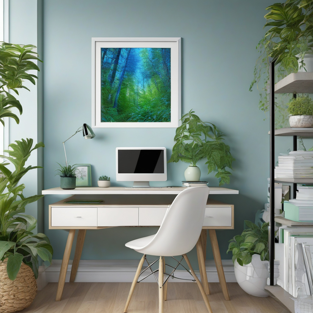
Los Angeles homeowners are increasingly embracing this science, with many reporting not just an increase in productivity but a better emotional connection to their workspaces. Light blue or soft green, for instance, offer the double benefit of soothing the mind while maintaining a professional look on camera.
In conclusion, selecting paint with purpose is not merely an aesthetic decision but a strategic one. It’s about aligning space functionality with mental wellbeing—an endeavor worth every thought.
Natural and Artificial Lighting: A Harmonious Partnership
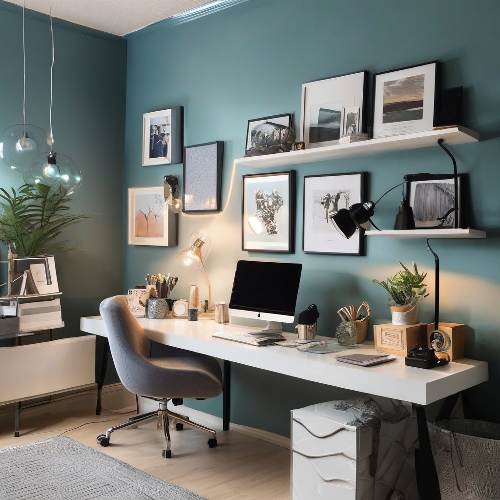
When it comes to maximizing the effectiveness of a home office, one must consider not only the paint color but also the lighting. The dance between natural and artificial lights can dramatically transform how colors appear in a room, thus impacting both mood and productivity.
Los Angeles’s ample sunshine provides abundant natural light, but it can also cast harsh shadows if not managed properly. Hence, many homeowners find themselves investing in both blackout curtains and sheer drapes to control the flow of light. This is complemented by strategically placed artificial lighting sources to maintain ambiance as daylight fades.
Conversely, over-reliance on artificial lighting can often lead to fatigue and decreased productivity. A balanced lighting arrangement ensures that colors remain true throughout the day, an essential aspect for maintaining a consistent on-camera presence during virtual meetings.
Ultimately, the goal is to create an environment where lighting enhances the chosen wall colors, uplifting the workspace and boosting both energy levels and virtual presentation.
“The right balance of natural and artificial lighting can significantly enhance a home office’s functionality and aesthetic appeal.”
Aligning your lighting strategy with your color choices ensures that your workspace is as engaging virtually as it is in reality.

The Best Seasons to Paint in Southern California
In Los Angeles, the weather is as much a part of life as the traffic, and it plays a crucial role in planning any home renovation project, painting included. Timing is everything when it comes to achieving a flawless finish without delays.
While Southern California may boast a more temperate climate than other regions, homeowners would do well to avoid the wet winters and scorching summers. The mild spring and fall months provide the perfect conditions for paint to dry evenly without undue stress from extreme temperatures.
A homeowner narrates his tale of woe, scheduling his painting project in August, only to battle paint that dried too quickly, resulting in cracks and required touch-ups. It’s this intricate balance that becomes an art form in itself, one that requires adhering to weather patterns to achieve optimal results.
For those looking to get the timing just right, planning painting projects in LA’s optimal seasons could mean the difference between effort and excellence.
In conclusion, aligning painting projects with favorable weather conditions ensures longevity and a stunning finish.
Material Considerations and Cost Management
The choice of materials can significantly influence both the outcome and the cost of a painting project. Whether covering a vibrant hue or a somber shade, the preparation and material costs can vary widely.
Using high-quality primers and paints is crucial, especially when transitioning from darker colors, as it prevents ghosting and ensures that new, desirable shades stand out boldly. Many painters advocate for priming, as detailed in this guideline on covering dark colors, as it saves future costs and maintenance woes.
In terms of budget, a clear understanding of materials is vital. Entry-level paints offer lower prices but may compromise on durability and aesthetic appeal. On the other hand, premium brands promise longevity and a sophisticated finish but come with heftier price tags.
Here’s a quick comparison of typical Southern California renovation costs:
| Material Type | Cost per Gallon | Application Use |
|---|---|---|
| Entry-Level Paints | $20–$30 | Small Touch-Ups |
| Mid-Range Paints | $40–$60 | Interior Walls |
| Premium Brands | $70–$100 | High-End Projects |
“Investing in quality materials ensures the longevity of your home office space, maintaining both style and substance.”
In conclusion, while managing costs effectively is essential, compromising on quality could lead to higher expenses over time.
The Risks and Rewards of Color Blocking
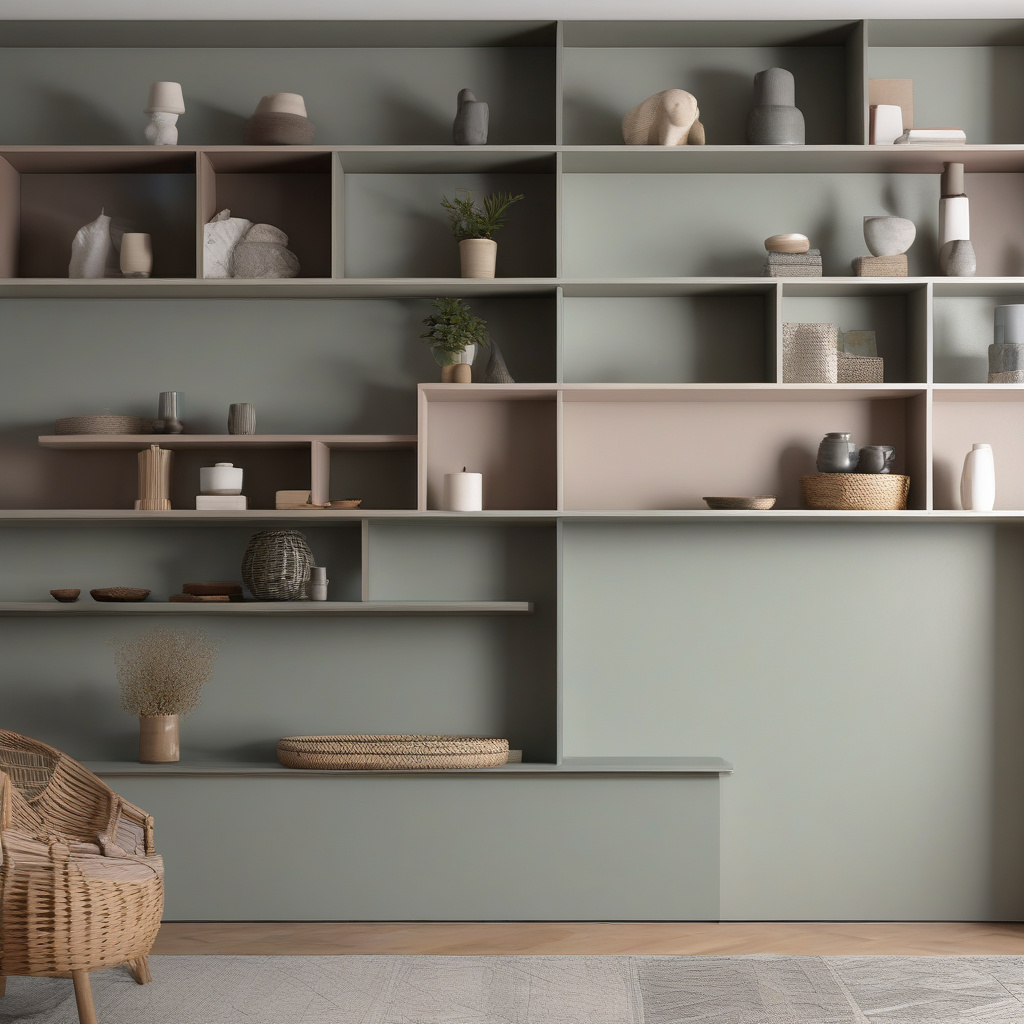
Color blocking is an advanced technique in interior design that homeowners wield to create visual interest and define space. Particularly popular in creative industries where inspiration is key, color blocking can transform a mundane space into a vibrant workspace.
However, it’s not without its challenges. Missteps in color choices or placement can lead to a disjointed appearance that distracts rather than inspires. Hence, many turn to professional guidance for a cohesive look, such as those tips highlighted in practical steps for successful color blocking.
In Los Angeles, where interior trends come and go as frequently as the ocean breeze, committing to a bold design choice requires careful thought. The rewards, however, are substantial—when done right, color blocking can inject character and style, making a lasting impression both in person and online.
“Properly executed color blocking in a home office can foster creativity and provide a unique spatial identity.”
In summary, while the risks of color blocking can be daunting, the potential to personalize and energize a space makes it a worthwhile consideration.
Implementing Your Vision: Step-by-Step Preparation
Transforming a vision into reality requires meticulous planning and execution. Follow these steps to ensure your home office meets both aesthetic and functional needs.
Step 1: Assessment and Inspiration
Begin with a careful assessment of your space. Measure dimensions and consider existing light sources. Gather inspiration from online galleries and articulate a clear vision for your space.
Step 2: Choosing the Right Colors
Leverage color psychology to make informed choices. Consider the emotional and psychological impacts of colors, and select those that align with your productivity goals.
Step 3: Preparing the Space
Before applying a fresh coat of paint, clean and prime the walls. Ensure the surface is smooth and free of imperfections to achieve a professional finish.
Step 4: Application and Touch-ups
Use quality brushes and rollers for even application. Allow proper drying time between coats. Finish with touch-ups to perfect and preserve your new environment.
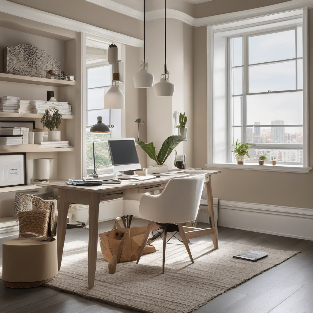
Armed with a strategic approach, any homeowner can create a home office that blends style with functionality, setting the stage for professional success.
- Color psychology plays a crucial role in productivity.
- Natural and artificial lighting impacts workspace ambiance.
- Selecting the right season to paint can ensure success.
- Invest in quality materials for quality results.
- Color blocking offers dynamic design possibilities.
“`html
FAQ
What are some home office paint colors that enhance productivity?
Choosing the right paint color for a home office involves more than meets the eye. In practice, colors like soft blues and greens are frequently selected for their calming effects, which in turn boost concentration. Many experts note that subtle earth tones can foster a sense of stability, creating a grounded work environment. Observing real office spaces can reveal how even a hint of yellow can stimulate creativity, offering a gentle energy uplift. The key is finding a shade that balances mood without causing distraction, as overwhelming hues might inhibit focus.
How do camera-friendly paint colors influence Zoom calls?
In the digital age, our walls serve as extensions of our presentation in virtual meetings. It’s no secret that neutrals such as gray and beige are camera-friendly, offering a professional backdrop that doesn’t clash with clothing. Additionally, pale pinks and peaches can soften skin tones, helping in avoiding harsh contrasts on camera. In practical terms, a too-bright white wall may reflect excessive light, washing out features, while deep tones might eat up the natural light, causing shadows. Aim for hues that enhance rather than overshadow your presence on screen.
What should I consider when choosing lighting for my home office?
Lighting is crucial in setting the tone for a productive workspace. Ideal lighting balances natural and artificial sources, minimizing glare and avoiding eye strain. In real renovation projects, adjustable desk lamps and soft overhead lighting are often paired to accommodate different tasks. Many homeowners with California’s ample sunlight find that positioning a desk near windows not only boosts mood but also reduces electricity usage. However, be cautious of direct sunlight, as it can create unwanted glare on screens. A layered lighting approach typically proves most effective in multifaceted work environments.
When is it worthwhile to repaint my home office?
Repainting your home office is worthwhile when the space feels dull or no longer supports your productivity. In many renovation experiences, homeowners often realize the necessity to refresh their workspace after significant life changes, such as a new job or switching to remote work. Additionally, if the current color no longer fits your style or appears worn, it’s time to consider repainting. An updated look can invigorate both the room and your work attitude, potentially boosting efficiency and comfort — essential elements for any productive setting.
What are typical mistakes to avoid when painting a home office?
Common mistakes in painting a home office stem from overlooking practical issues. Relying solely on trending colors, for instance, might result in a space that’s visually appealing but not necessarily functional for work. Another oversight is neglecting the interplay between light and color; a paint sample might appear different under varied lighting conditions. Homeowners frequently underestimate the impact of undertones — a supposed neutral may have an unwanted warm or cool tint that becomes evident post-application. Before embarking on your project, consulting with a professional might save considerable time and expense.
What are the cost considerations for painting a home office?
Cost involves both material and labor, varying widely based on room size and paint quality. In practical scenarios, a DIY approach may lessen expenses but could compromise on finish if the skill level isn’t adept. Many homeowners find value in hiring professionals for their experience and speed. For budget-conscious projects, selecting premium paints with higher coverage reduces the number of coats needed, offering long-term savings. Remember that preparation, such as patching holes and taping, also factors significantly in both time and cost. For specialized advice tailored to your specific needs, consider reaching out for the most reliable guidance.
What are the pros and cons of using wallpaper instead of paint in a home office?
Wallpaper can introduce texture and pattern not easily achievable with paint. Its ability to transform a plain wall into a feature point is unmatched. In practical renovations, wallpaper might be favored for its long-lasting appeal and the ability to mask wall imperfections. However, it also presents challenges. Installation is more labor-intensive, and removal can be difficult. Unlike paint, if a section is damaged, repairs can be complex. Painting, in contrast, allows easy touch-ups. Ultimately, the decision hinges on your willingness to invest in initial effort versus long-term upkeep.
How do seasonal changes affect paint color choices for a home office?
Seasonal shifts can dramatically influence how we perceive colors. In winter, muted hues might seem drab, whereas the same colors can provide calming relief during brighter summer months. In homes with significant seasonal sunlight variation, choosing a paint color that accommodates both ends of the spectrum becomes essential. In California’s varied climate, a mid-tone shade can adapt well, providing warmth in cool periods and reflecting light in warmer ones. Homeowners often find that a timeless, neutral palette provides the flexibility to accessorize with bold colors as seasons change, maintaining room freshness year-round.
“`