In a city where first impressions often mean everything, Los Angeles homeowners are on an exhilarating quest for exterior trim and door colors that don’t shy away from making bold statements. Laced with the rich hues of charcoals, audacious reds, and harmonious earthy tones, these daring choices aren’t merely about aesthetics; they signify an awakening in the world of exterior design. But how does one navigate such a dynamic landscape while ensuring harmony with the city’s architectural flair?
Brief summary: This article delves into the vibrant world of exterior trim and door colors that enhance curb appeal in Los Angeles. It explores bold color choices like charcoals and reds, examines costs and materials, and blends professional insights with real homeowner experiences in Southern California remodeling projects.
The Bold Palette: Making a Statement with Color
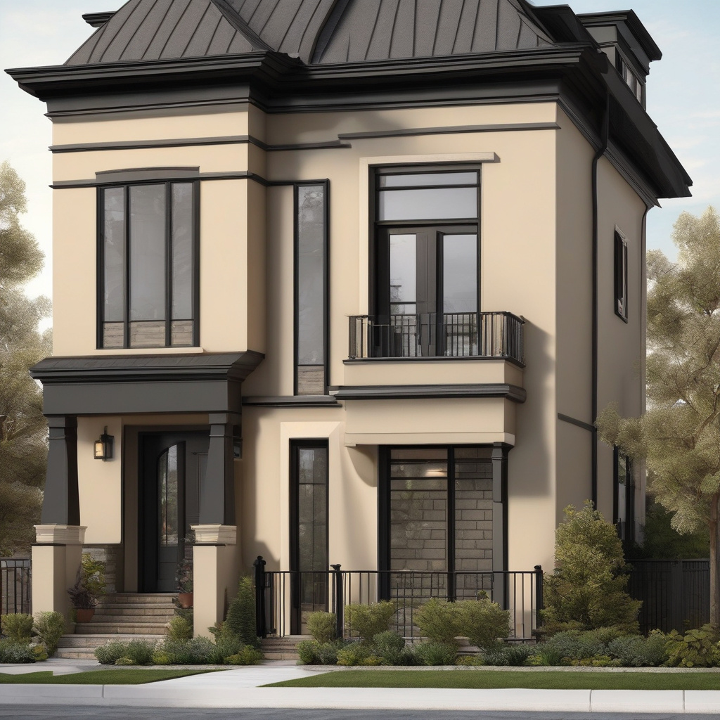
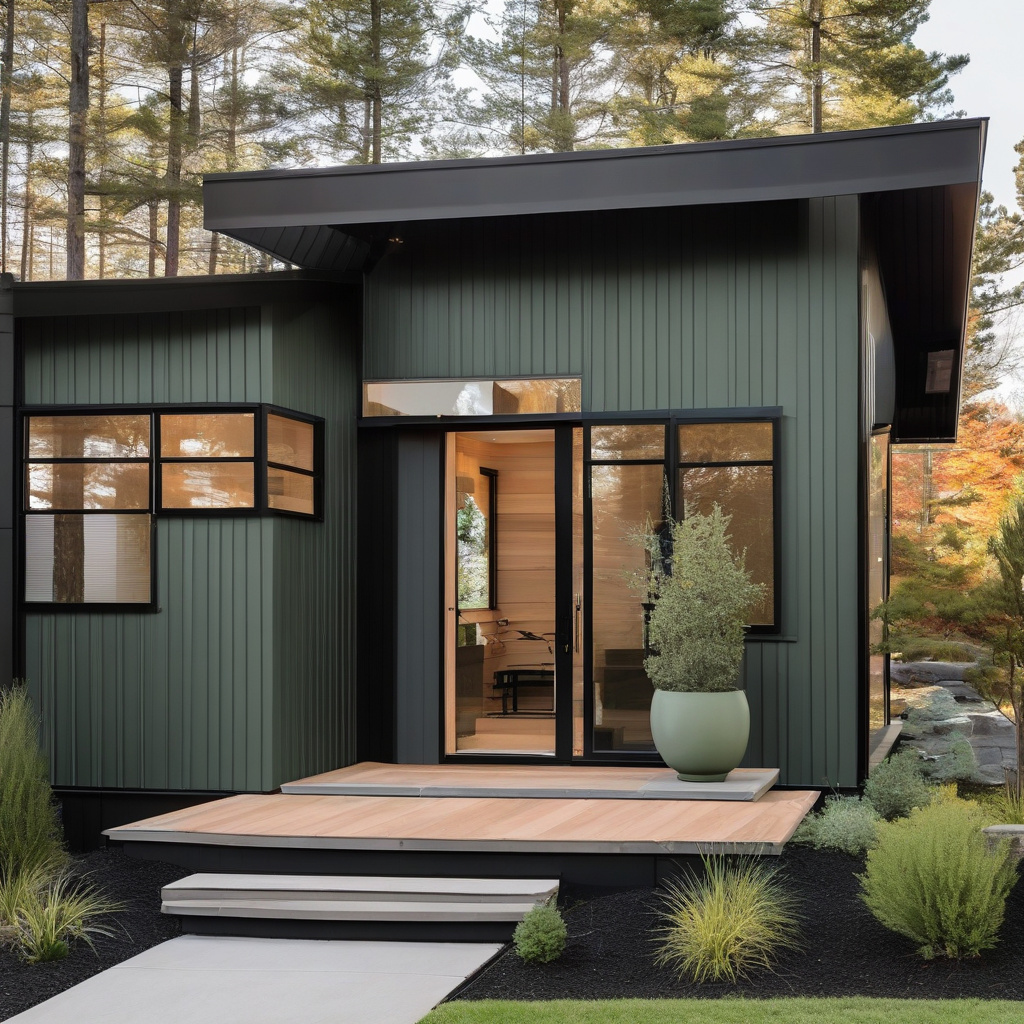
Los Angeles is a city built on the spirit of reinvention, and its homes are no exception. An exterior color choice is not just pigment on wood; it’s a reflection of personality and a nod to local architectural lineage. Many find themselves gravitating towards rich charcoals, which evoke sophistication and modernity. These shades are particularly effective when applied to the trim, offering a striking contrast against more muted walls.
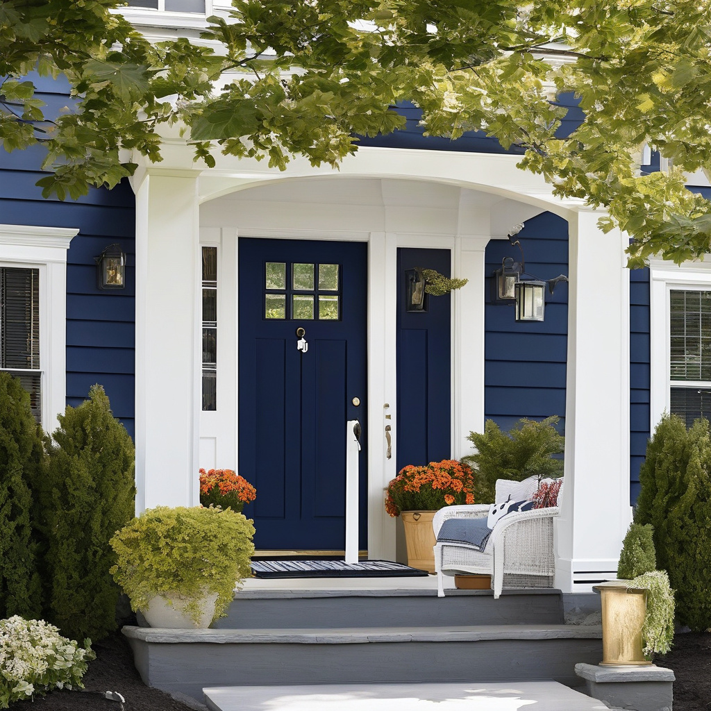
But what makes a color truly pop in the LA sun? Reds have their own place on this spectrum, offering warmth and vibrancy. Homes in bungalows and craftsman styles can become instant neighborhood highlights with a front door painted a bold crimson. As residents embrace distinctive hues, maintaining a balance with the surrounding environment is crucial.
Meanwhile, earthy tones bring a touch of nature to urban settings, their subtle yet powerful presence reminding onlookers of the California landscape’s inherent beauty. Terracotta, in particular, has seen a resurgence, marrying historical charm with contemporary whims.
Yet, the essence of impactful color lies not only in its shade but in its finish. Glossy sheens glisten under sun-drenched skies, while matte finishes offer a daring contrast to a high-energy locale. The choice is as much about tactile feel as it is visual appeal.
Whatever the choice, embracing a bold palette is to recognize that some risks carry the reward of undeniable curb appeal.
Understanding the Trends: What Drives Popularity?
As any seasoned professional will tell you, the allure of certain exterior colors shifts with the cultural winds. In Los Angeles, where classic Hollywood glamour meets cutting-edge modernism, this means a constant evolution driven by both historical roots and future aspirations.
Consider the rise in popularity of cool, neutral trims that enhance a home’s architectural lines without drowning them in harshness. Such trends are not merely aesthetic; they align with a growing appreciation for sustainable and energy-efficient homes. After all, lighter tones on exteriors can significantly lower cooling costs during blistering summers.
Moreover, the popularity of color choices like sage and ocean blue echoes the region’s reverberating ties to the natural world. Equally, these colors are ideal candidates for homeowners ready to embark on transformational restoration projects inside and out.
Yet, the resurgence of bold reds and charcoals speaks to a city’s inherent confidence. The unabashed use of color is indicative of individualism, a call to neighbors: notice me, admire me, and remember me. This trend thrives on daring homeowners willing to push boundaries.
Color trends in exterior decor are thus more than just fleeting fashion statements; they represent the zeitgeist of a city that refuses to stand still.
Data from the U.S. Energy Information Administration highlights that homes with lighter exteriors may save up to 40% on cooling costs annually.
Cost Considerations in Color Selection
No discussion about exterior renovation is complete without addressing costs, which vary not just by the color but also by the associated materials and techniques. Painting a home’s exterior, especially when opting for high-quality, durable paints, can be a hefty investment, often running into thousands of dollars.
For those keen on obtaining the best value, considering the paint’s special features such as UV resistance and weatherproofing is crucial. Additionally, labor costs in Los Angeles tend to reflect the region’s high cost of living, with skilled painters charging a premium for their expertise.
One must not overlook the maintenance that bold colors can necessitate; darker tones, while stunning, can fade faster in the intense Southern California sun. It’s a balance of aesthetic ambition and practical maintenance needs.
| Option | Estimated Cost | Timeline | Durability |
|---|---|---|---|
| Rich Charcoal | $3000 – $5000 | 1-2 weeks | High |
| Bold Red | $3500 – $5500 | 2-3 weeks | Moderate |
| Earthy Tones | $2800 – $4800 | 1-2 weeks | High |
Ultimately, wise investment in colors and finishes can heighten a property’s value, making it more desirable in a competitive market without neglecting longevity.
Integration with Local Architecture Styles
Matching exterior trim and door colors to the surrounding architecture is more than just a contemporary trend; it’s a blend of tradition and transformation. Los Angeles offers a diverse spectrum of architectural styles, from sleek minimalist abodes to the rustic charm of Mission Revival heritage.
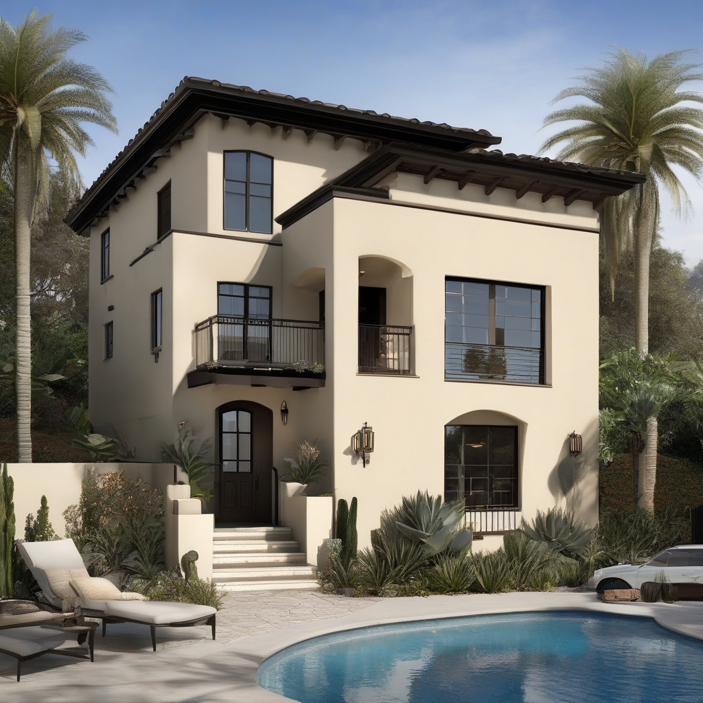
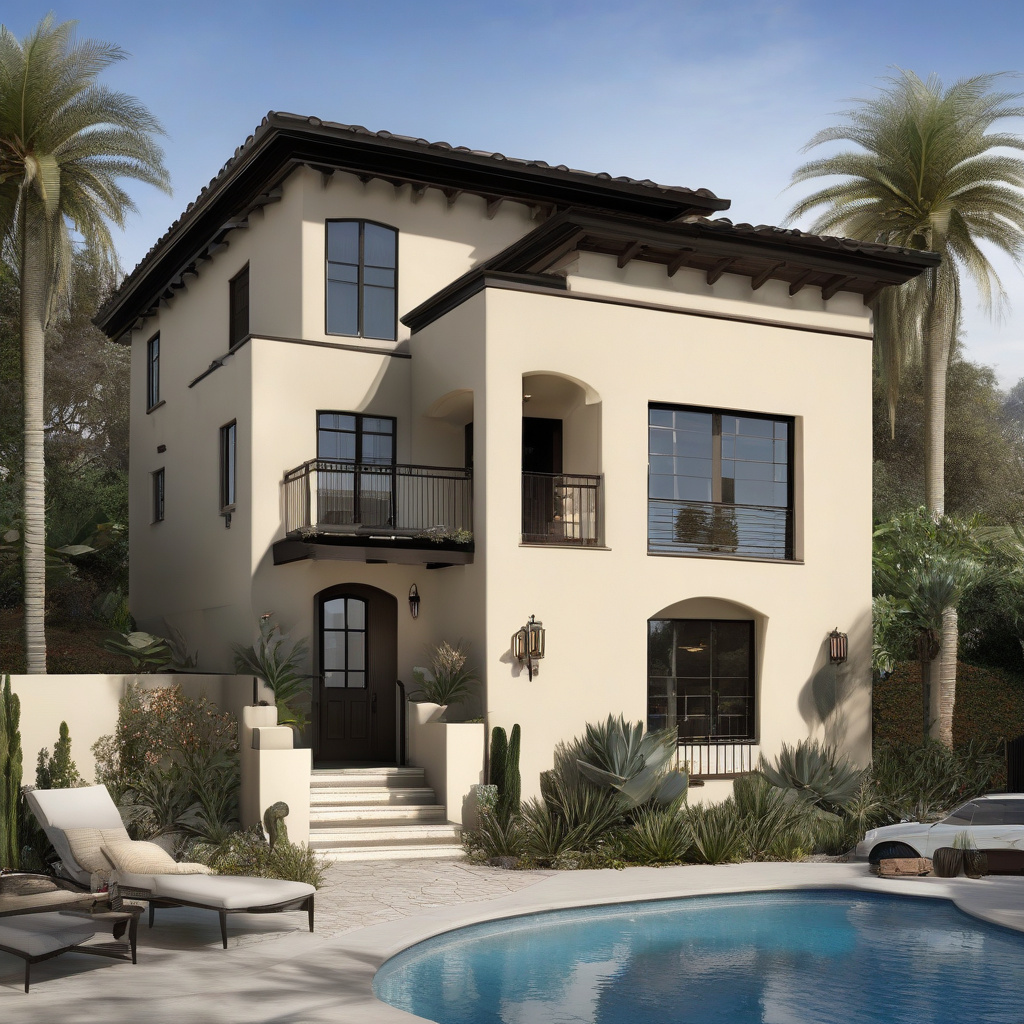
Colors like rich charcoals and bold reds are often seen on the contemporary homes of the Hollywood Hills, casting a stark yet beautiful contrast against minimalist façades. Meanwhile, the Spanish-inspired builds of historic Los Angeles neighborhoods are a natural canvas for earthy tones, complementing sunlit stucco walls with earthy trims.
Homeowners must balance these aesthetic choices with architectural respect, ensuring new additions harmonize with existing elements. This thoughtful integration can elevate both the building and the street it graces.
When establishing synergy with the home structure, colors should neither overpower nor blend into oblivion. Instead, they should highlight architectural details, acting as a focal point rather than an afterthought.
Jane Smith, a renovation expert from West LA, notes that “a well-chosen color scheme can dramatically enhance architectural features, turning an ordinary structure into a local landmark.”
Embracing a keen sense of locality in color selection is key to achieving a home that resonates both personally and publicly.
Step-by-Step Guide to Achieving the Desired Look
For those homeowners bitten by the remodeling bug, the path to achieving the perfect exterior color facade is as much about preparation as it is execution. For starters, understanding the canvas involves a thorough evaluation of the home’s exterior structure and existing condition.
Preparation is Key
Before actual painting begins, it’s essential to address possible imperfections. This can involve cleansing surfaces, repairing any damaged sections, and ensuring a smooth base for new paint. It’s essential for the new coat of paint to adhere seamlessly.
Another consideration is the underlying hues and imperfections that might exist. Ensuring that any previous colors and textures are adequately primed will prevent them from affecting the vibrancy of the new selections.
Choosing the Right Tools
The tools and materials matter. Invest in high-quality brushes, rollers, and paints specific to exterior use, known for their durability against extreme temperatures. This ensures that the facelift lasts, resisting wear and tear from LA’s dynamic climate.
The next step involves meticulous application, beginning with trim areas before transitioning to larger surfaces. Patience and precision go a long way in achieving an even, professional finish.
Final Inspection and Touch-Ups
Upon completion, a detailed inspection can highlight minor imperfections requiring minor touch-ups. Addressing these ensures maintaining that fresh, rejuvenated look as the seasons change.
Research shows that homes with freshly painted exteriors can increase their market value by approximately 5-10%.
Following these outlined steps, transforming your home’s exterior color will be both rewarding and aesthetically pleasing, attracting attention for the right reasons.
Looking Ahead: What’s on the Horizon?
As the city continues to evolve, so do the styles and trends in home exteriors. Now entering an era where personalization meets sustainability, homeowners are integrating smarter solutions. These include paints designed to lower energy costs and exterior designs that use color for passive cooling.
What will tomorrow’s standout color be? While no one can predict precisely, the thematic core remains consistent—improving a property’s market appeal while reflecting the owner’s personality and values.
Forward-thinking practices suggest a blend of new technologies with traditional aesthetics, allowing freedom of expression alongside environmentally conscious decisions. By turning to seasoned practical guides for seamless execution, projects can transition smoothly into real-world application.
For those who seek change, the sunny heart of California capsulates limitless inspiration. As more eyes turn westward, new doors of opportunity—and color—await adventurers in home renovation.

In closing, whether it’s finding the perfect hue or crafting a sustainable home solution, the options are endless and await your creative input.
- Bold exterior colors like rich charcoals and reds make homes stand out in Los Angeles.
- Color choices are influenced by cultural trends and environmental considerations.
- Understanding costs and preparation is crucial to successful implementation.
- Integration with architectural style enhances both property value and neighborhood aesthetic.
- Forward-thinking trends merge sustainability with personal expression in home renovation.
FAQ
What are some popular exterior trim and door colors that make a home stand out?
In the realm of exterior home design, color is a powerful tool. Many designers find that rich charcoals, vivid reds, and earthy tones like terracotta or olive enhanced curb appeal significantly. These choices often reflect a harmony between modern trends and classic architectural styles, particularly prevalent in Los Angeles. In practice, using a bold, distinctive door color can create a visual focal point, drawing attention to an entryway and providing an inviting first impression. Observing neighborhoods in LA reveals many homes utilizing these color schemes effectively, making them a popular pick among homeowners aiming for a standout yet harmonious look.
How do I choose the right exterior trim and door color for my home?
Choosing the right color involves understanding the style and era of your home and the neighborhood vibe. Experts recommend starting with examining the undertones of existing materials, such as roofing and masonry. For instance, a Mediterranean-style home looks stunning with earthy, muted tones, while a contemporary build might be better with striking contrasts. A common mistake is ignoring the landscape’s natural hues, which can clash with the house if not thoughtfully considered. In real renovation scenarios, sampling several shades on site helps ensure the chosen colors complement each other under different lighting conditions before finalizing your decision.
When is it beneficial to repaint exterior trims and doors?
In renovation practice, painting exterior trims and doors is often beneficial when preparing to sell, as it boosts curb appeal, or after harsh weather conditions which can wear down paint. Another strategic time for painting is during a larger home renovation when updating other exterior elements such as siding or roofing. Many homeowners underestimate the impact of faded or chipped paint on their home’s perceived maintenance. Ensuring that trim and door paint are refreshed in a timely fashion helps protect against weather damage while enhancing overall aesthetic appeal, making it appear well maintained and attractive to passerby and potential buyers alike.
What are common mistakes to avoid when selecting exterior trim and door colors?
One significant mistake is choosing colors without considering the surroundings, such as landscaping, and existing exterior materials. In practice, many homeowners choose colors indoors without realizing how lighting affects exterior perception. Busy or overly bright colors can also diminish the architectural lines of a home. Another frequent error is picking trendy colors that clash with the home’s style, such as using a stark modern palette on a historic Craftsman bungalow. It’s crucial to test colors outside and observe them at different times of day, as this approach provides insight into how the colors harmonize with both the home and its environment.
How do costs vary when considering different exterior paint colors?
The cost of painting your home exterior can vary significantly based on the colors chosen and their quality. High-quality paints with rich pigments are often more expensive, yet they provide better coverage and longevity, reducing the need for frequent repainting. In renovation scenarios, opting for premium paints is advised as they offer weather resistance and color retention, which is crucial in sunny locales like California. Additionally, labor costs may increase with intricate color schemes due to the need for more precise application. Homeowners should budget accordingly, considering both material and labor costs, ensuring a durable, visually pleasing result.
What are the advantages and disadvantages of using bold exterior colors?
Bold exterior colors can enhance a home’s visual impact and make it distinct in neighborhoods where differentiation is desired. The main advantage is increased curb appeal, which can significantly boost property value and attractiveness. However, bold colors are not without their drawbacks. They can lead to quicker fading, especially under direct sunlight, common in areas like Southern California, necessitating more frequent repainting. Overpowering hues may also deter potential buyers if they prefer more subdued aesthetics. It’s a balance between artistic expression and practical considerations, requiring thoughtful planning to ensure harmony with surroundings.
How should I maintain my exterior trims and door colors?
Maintaining exterior trims and door colors involves regular inspections and cleaning to prevent dirt accumulation and detect early signs of peeling or fading. Many experts recommend washing your exteriors annually and applying a fresh coat of paint every 5-10 years, depending on the paint quality and environmental exposure. For those unsure about starting their maintenance journey, it could be beneficial to consult a professional who can provide tailored advice based on specific paint types and regional climate characteristics. You can reach out for expert guidance through their expert contact page for more personalized maintenance solutions.
What considerations should be taken when renovating older homes with new color schemes?
When renovating older homes, respecting the historical context with your color choices is essential. Preserving architectural integrity while modernizing involves selecting shades that highlight a home’s original features. Restoration projects often reveal opportunities to combine historically accurate colors with modern pigments for longevity and vibrancy. In real-life scenarios, it’s noted that choosing sympathetic colors ensures the charm of older homes is enhanced rather than overshadowed. Consulting historical color palettes can be beneficial, providing a framework for introducing contemporary elements without clashing with the home’s vintage essence.