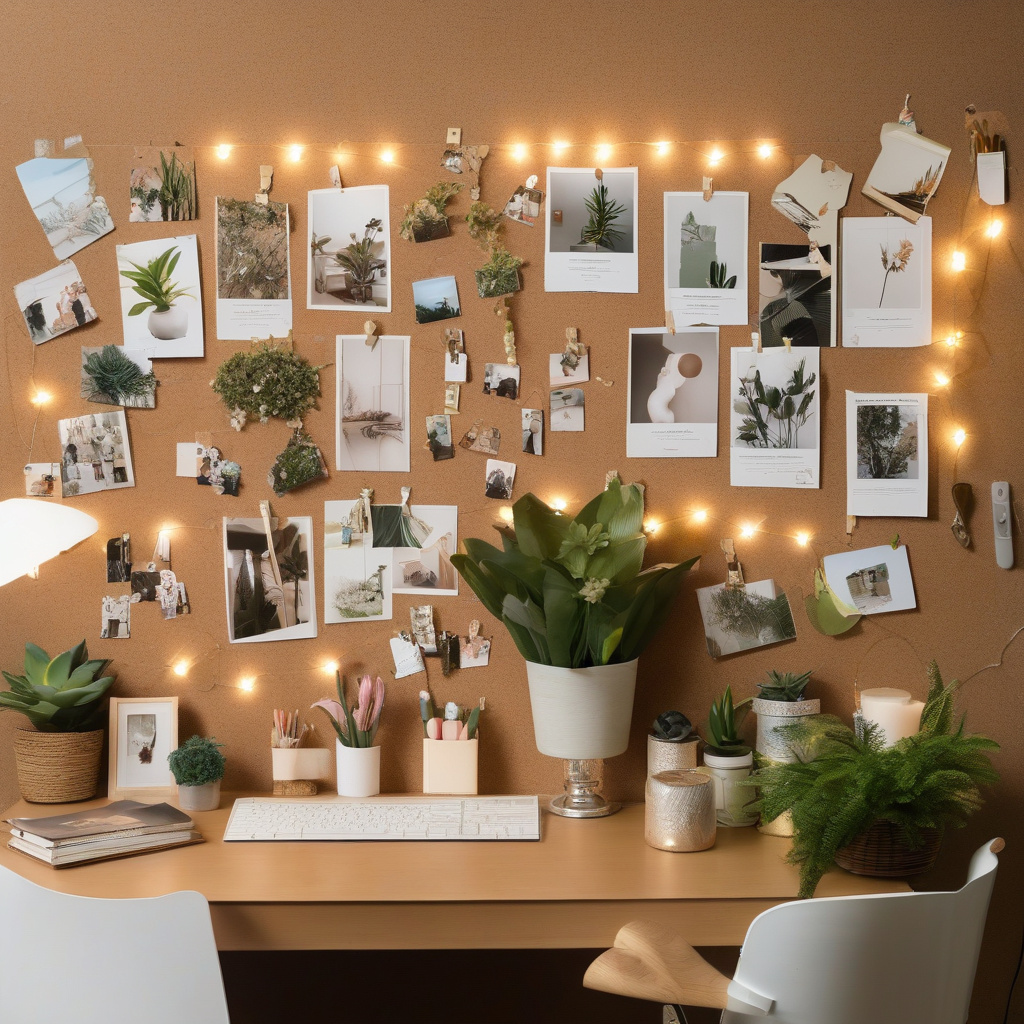
In the sunlit stretches of Los Angeles, where style meets practicality, crafting the perfect bathroom starts long before the drywall is smashed. It begins with a mood board. A simple yet powerful tool in the renovator’s arsenal, these visual collages assemble a symphony of colors, textures, and fixtures to orchestrate the bathroom of your dreams. But why has this trend spilled over from fashion shows to family homes? And more importantly, how can you master it for your Southern Californian retreat?
Brief summary: This article delves into the transformative power of mood boards for bathroom renovations in Los Angeles, detailing how they assist homeowners in harmonizing colors, textures, and fixtures to define bathroom style. Practical examples, cost comparisons, and expert insights provide in-depth guidance on this emerging trend.
The Power of Planning: How Mood Boards Influence Renovation Outcomes
Renovating a bathroom in Los Angeles can feel like deciphering an architect’s blueprint written in a foreign language. It’s a significant undertaking, demanding clarity and vision from the very outset. Mood boards have soared in popularity not just because they look pretty on Instagram, but because they anchor the disparate elements of a project into a cohesive plan.
According to local contractors, a well-prepared mood board can be a game-changer. By laying out various materials, colors, and layout ideas visually, homeowners can avoid costly missteps and indecision. This clarity is vital when you consider the financial stakes, with bathroom remodels in Los Angeles often exceeding $20,000.
Creating a bathroom that’s both aesthetically pleasing and functional requires careful planning, something a mood board facilitates by providing a tactile representation of ideas. In essence, it’s a pre-emptive strike against the chaos of renovation fatigue—turning vision into reality without breaking the bank.
Reader insights reveal that as many in the area embrace urban bohemian vibes or mid-century modern aesthetics, mood boards spring forth as the bridge between aspiration and achievement. By exhibiting tangible connections between different elements, homeowners are more empowered to communicate their desires to contractors, ensuring the final product meets or surpasses expectations.
In conclusion, mood boards serve as a blueprint of possibilities, allowing renovation dreams to manifest effortlessly into tangible excitement.
Research indicates that 45% of homeowners who used mood boards had fewer project delays and change orders compared to those who did not.
Diving into the Details: Design Considerations for an Impeccable Mood Board
In embarking on a renovation journey, there’s no one-size-fits-all approach. That’s why many homeowners find solace in the granular approach of a mood board, which tailors the renovation experience to individual tastes and functional needs. It’s here where a shift from theory to practice begins.
Start by gathering inspiration: leaf through design magazines, scour Pinterest, or flip through the portfolios of local remodeling firms. The aim is to distill a broad array of styles into a personal anthology of favorites. Popular choices in Los Angeles include coastal minimalism and industrial chic, each offering a unique canvas for expression.
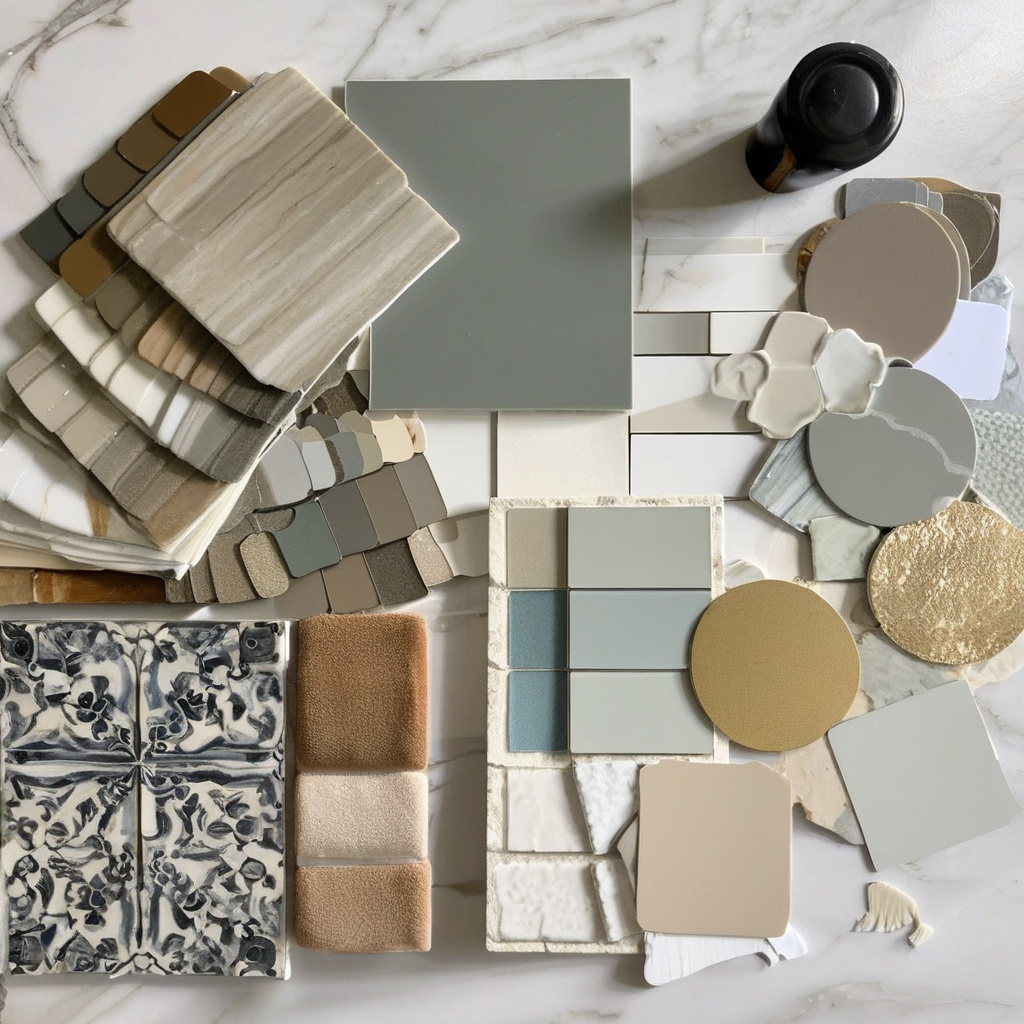
A functional mood board encapsulates materials, color palettes, and safe bathroom design elements. Consider coordinating soothing hues with textures like natural stone or reclaimed wood, which introduce warmth and elegance. Quartz countertops and subway tiles might emerge as frenetic trends, but their inclusion should depend on their compatibility with the environment already envisaged on your board.
Having gathered these elements, splice together an initial draft, then step back to evaluate its coherence. Does it tell a story that aligns with your daily routines and long-term dreams? Adjust generously, as the power of a mood board lies in its flexibility.
Ultimately, designing a mood board is akin to an artist’s sketch—it sets expectations, guiding both the aesthetic and functional aspects of your future support.
“A comprehensive study found that 67% of successful renovations began with a detailed mood board phase, highlighting its effectiveness in project planning and execution.”
Weighing the Pros and Cons: From Inspiration to installation
The challenge of making myriad decisions can be daunting, which is why mood boards shine as navigational aides through the creative fog. Yet, like every powerful tool, they come with their own set of challenges and considerations.
On the plus side, mood boards encourage exploration without commitment. By experimenting with ideas digitally or physically, there is the freedom to assess various aesthetics without purchasing materials prematurely. They also facilitate clearer communication with contractors, reducing the chances of costly misinterpretations.
However, their preconception requires a keen eye for detail. Launching into your project with broad, undefined themes risks misalignment with your practical needs or budget constraints. Overcomplicating designs may lead to decision paralysis or finding yourself insisting that avocado green really is your thing.
Inevitably, the balance of this process informs overall satisfaction with the finished project. People who adeptly manage their mood boards often find themselves more satisfied with their bathroom renovations than those who navigate without guidance.
| Option | Average Cost (LA) | Timeframe | Associated Risk |
|---|---|---|---|
| Traditional styles | $15,000 – $20,000 | 6-8 weeks | Medium |
| Modern designs | $20,000 – $30,000 | 8-10 weeks | High |
| Eco-friendly solutions | $25,000 – $35,000 | 10-12 weeks | Low |
In summary, the advantages of mood boards often outweigh their potential pitfalls by fostering creativity while maintaining realistic guardrails.
An Expert’s Eye: Enhancing Your Mood Board Experience
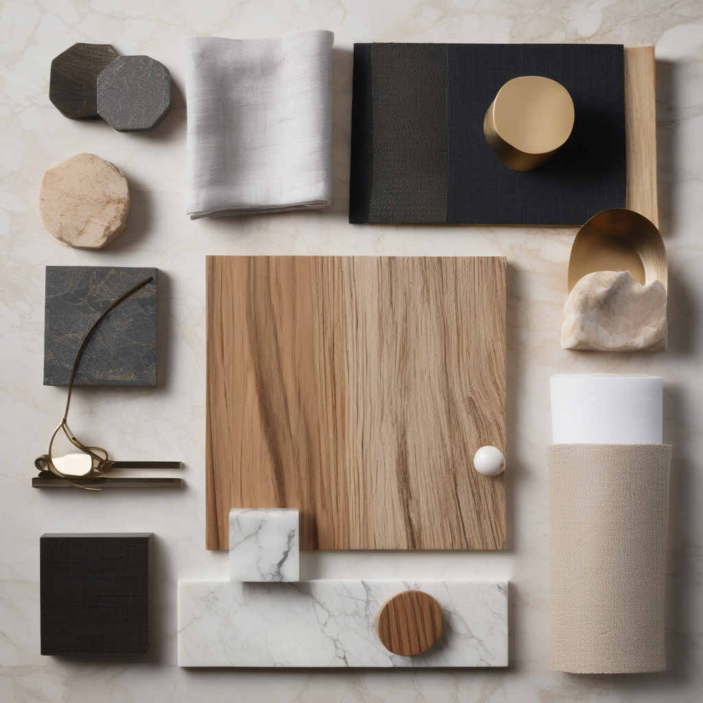
A mood board that truly captures your vision is often more than surface deep. Industry experts suggest it’s also about channeling both aspiration and pragmatism. Professional designers frequently recommend setting clear priorities on what the bathroom should achieve, whether it be maximizing space or establishing a luxury spa ambience.
Furthermore, avoid the temptation to go too trendy. While it can be enticing to input passing fads, how the design will age remains paramount. Choosing timeless over trendy can often translate into lasting value and curb appeal.
Adding unexpected details can also make a significant difference—mirrors that amplify light or bespoke lighting fixtures can turn ordinary into extraordinary. For families, practical elements such as classic design options remain invaluable, skirting around fleeting tastes for enduring appeal.
Finally, ensure the mood board incorporates functional aspects, such as plumbing layouts and storage solutions. As renowned architect Frank Lloyd Wright once mused, “Form and function should be one, joined in a spiritual union.” A bathroom that looks stunning but lacks practicality soon frustrates even the most attentive decorator.
In conclusion, do not overlook the mood board’s potential to become both conductor and orchestrator, not only elevating the ambiance but also ensuring each feature supports a harmonious lifestyle.
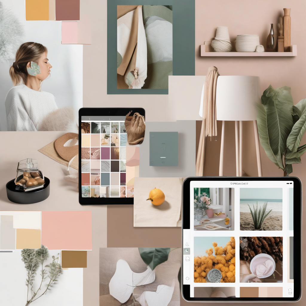
Insight from the 2023 Trends in Home Design report states that 56% of Los Angeles homeowners prioritized eco-friendly materials and energy-efficient fixtures during renovations.
The Step-by-Step Guide: Crafting Your Perfect Mood Board
Creating a mood board is as much a craft as an art—approached methodically, it promises a focused and efficient renovation path. Here’s a step-by-step guide to master the process:
Step 1: Define the purpose and scope of your bathroom remodel. Choose a few themes that resonate well with your lifestyle: ask yourself questions like “Does it cater to relaxation?” or “Is it child-friendly?”
Step 2: Gather inspiration from diverse sources. This may involve assembling elements such as painted ceramic swatches or browsing through virtual design platforms.
Step 3: Experiment with layout potentials. Consider how elements will flow practically within the spatial architecture of your room.
Step 4: Finalize your board, balancing aesthetics alongside practical considerations. Verify that choices are congruous and augment the overall environment.
Step 5: Share your board with professionals to secure informed feedback. This is essential for identifying overlooked areas and refining even further.
Once completed, your mood board resides not as a mere collage but as a guiding beacon illuminating the entire renovation endeavor.
Ultimately, a well-designed mood board empowers you to make informed decisions, ensuring a resonant harmony between style and functionality.
Making Mood Boards Work for You: Avoid Common Pitfalls
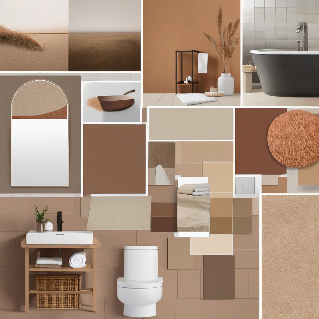
Many an ambitious renovator has found their mood board experience thwarted by common pitfalls. Chief among them is overreliance on digital platforms, which can’t replace the texture and tangibility of physical samples.
Another misstep is neglecting practical constraints. Always account for realistic budgetary limits and the confines of physical space to avoid unfeasible aspirations.
Lastly, it’s crucial to incorporate input from household members. Creating a design that aligns with everyone’s needs prevents disagreements and enhances collaborative enjoyment of the new space.
Steering clear of these issues ensures the creation of a mood board that not only speaks to vision but also holds up under the scrutiny of experience.
National housing studies show modern makeover strategies, supported by thorough mood boarding, often lead to a 70% better return on investment.
Next Steps: Plotting the Path from Mood Board to Reality
Post-mood board creation, the road to renovation victory involves strategic execution. Translate your visual blueprint into actionable steps with vetted contractors or DIY methods. Given the complex nature of remodeling, consulting experts in fields like plumbing or electrical systems ensures high standards and compliance with local building codes.
Consider the nuances of material selection, where quality should never be compromised for cost-saving. Reputable suppliers in Los Angeles offer materials that suit different aesthetic preferences while adhering to safety and sustainability standards.
Layout choices also require attention. Exploring the impact of factors like tile layout directions can dramatically affect the room’s perception of space and dynamics.
Continue to refine and adapt your plans even as construction unfolds. Unexpected challenges are par for the course, yet a flexible mindset ensures the final reveal radiates reflections of meticulous preparation and passion for perfection.
In summary, as the tools return to their toolbox and the dust settles, the goal is to experience a space that does more than impress visitors—it continually reaffirms the smart choices made at the starting line with your mood board.
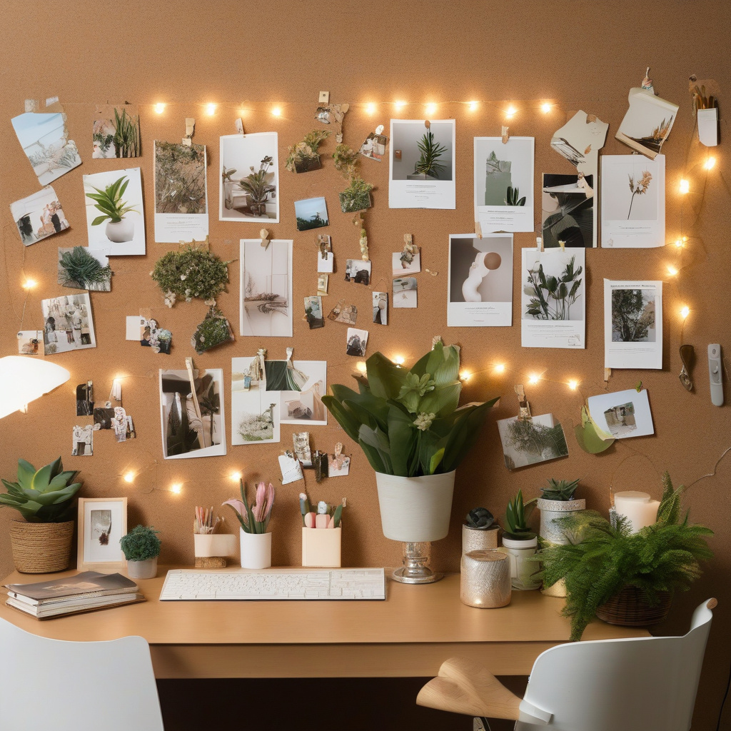
- Design mood boards express personalized style and boost project clarity.
- In-depth planning with mood boards smooths over potential renovation hurdles.
- Real-life examples and expert input help steer aesthetic and functional decisions.
- Evaluating pros and cons of mood board use aids in maximizing renovation impact.
- Executing mood board insights can enhance long-term satisfaction and ROI.
“`html
FAQ
What is a mood board in the context of bathroom renovation?
In the realm of bathroom renovations, a mood board serves as a visual preview of your design ideas. It incorporates colors, textures, and fixture samples that cohesively represent the intended style of your space. Think of it as a creative collage where tile samples sit alongside fabric swatches and photographs of fixtures you love. In practice, crafting these boards allows homeowners to visualize how disparate elements will harmonize in their remodeled bathroom. This proactive step often highlights unexpected clashes or delightful synergies before committing to purchases, saving time and reducing costly revisions down the road.
How should I choose the elements for my bathroom mood board?
Selecting elements for your mood board requires a thoughtful approach to ensure the final design is cohesive. Begin by identifying a central theme or inspiration, such as a favorite piece of art or a location that evokes a particular feeling. From there, collect color samples, material textures, and fixture designs that complement this theme. In the renovation industry, many recommend starting with a neutral base and then introducing one or two striking elements for contrast. During this process, it’s crucial to include samples of actual materials where possible—such as tiles and fabrics—since these provide a tangible sense of texture and color that digital images cannot fully convey.
When is creating a mood board particularly beneficial?
Creating a mood board proves especially valuable at the outset of the renovation planning phase. When embarking on extensive remodels, as seen in many California homes, the sheer number of available design options can be overwhelming. A mood board streamlines decisions by providing a visual roadmap that guides choices and helps maintain focus. Additionally, it’s a useful tool for communicating ideas with contractors or designers, ensuring everyone involved has a shared vision of the desired outcome. Many professionals agree that a well-prepared mood board can significantly reduce the likelihood of costly missteps and ensure alignment across the project team.
What are the typical mistakes to avoid when creating a mood board?
One common pitfall in crafting mood boards is overcomplicating the design with too many competing elements. Homeowners often underestimate the power of simplicity and coherence. In real renovation projects, elements that clash in color or style can derail the aesthetic cohesion. It’s also easy to fall in love with a variety of ideas and attempt to incorporate them all, which may result in a disjointed final design. Therefore, it’s important to filter your choices: focus on a limited palette and a select few standout features. Additionally, failing to incorporate practical aspects such as lighting and functionality can lead to a beautifully styled but impractical bathroom space. Balance aesthetics with realism for the best results.
How do mood boards impact renovation costs?
Mood boards, surprisingly, have a profound impact on controlling renovation costs. By clarifying a visual plan from the start, they help avoid unnecessary purchases and guide focused shopping, thereby reducing impulsive, costly mistakes. For example, without a mood board, you might opt for high-end Italian tiles on a whim, only to find later that they don’t complement your intended style. They allow you to assess and compare cost options visually, accommodating budget considerations within the aesthetic framework. Ultimately, a clear, well-conceived mood board acts as both a creative tool and a financial safeguard, making it a smart investment for any renovation project.
What are the pros and cons of using mood boards?
Mood boards offer several benefits, including the ability to visualize and refine design ideas before implementation, which can significantly reduce decision fatigue during renovations. They facilitate communication between homeowners and renovation teams, ensuring alignment on project direction. However, there are drawbacks to consider. Time investment is required to create effective boards; it’s not merely a quick collage but a deliberate selection of ideas that might evolve over time. Furthermore, there’s the risk of becoming overly committed to a vision that proves impractical or too costly. Successful mood boards balance inspiration with feasibility, providing a flexible framework that can adapt as your project develops.
What opportunities and risks are associated with bathroom mood boards?
Creating a mood board opens up a world of creative possibilities, allowing you to explore various style combinations and design concepts in a low-commitment format. It’s an excellent opportunity to experiment with bold designs and unique textures that you might shy away from without a visual guide. However, risks include the potential for unrealistic expectations—what looks good on paper may not translate well into your existing space due to structural limitations or lighting conditions. Moreover, getting too attached to an idealized version of your bathroom may lead to challenges if budget constraints or availability of materials intervene. Engaging with expert renovation advice early on, using resources such as this California renovation specialist contact approach, can mitigate these risks effectively.
What maintenance or installation considerations should I keep in mind for bathroom renovations?
When diving into bathroom renovations, maintenance and installation specifics are paramount. For instance, in older homes, you may need to consider the condition of existing plumbing and wiring, which can impact both fixture choices and installation procedures. Modern fixtures may require updates to these systems to ensure compatibility. Moreover, the finishes you select must not only be visually appealing but also practical—consider moisture resistance and durability, especially in high-traffic bathrooms. Many renovation experts caution against ignoring long-term upkeep; materials that look fantastic initially might require significant maintenance over time, potentially exceeding budgets. Consulting with seasoned professionals can clarify these complexities and help you navigate the renovation process most effectively.
“`