In the bustling metropolis of Los Angeles, where backyards often transform into serene retreats, Accessory Dwelling Units (ADUs) offer a unique opportunity to blend the comforts of interior spaces with the serene allure of the outdoors. Homeowners are turning to airy neutrals, soft greens, and warm clays to create inviting spaces that seamlessly connect indoor living with the natural environment.
Brief summary: This article explores the trend of using airy neutrals, soft greens, and warm clay colors in ADU interiors in Los Angeles. It provides insights into renovation choices for enhancing compact spaces to feel open and connected to nature, aligning with the city’s unique outdoor culture.
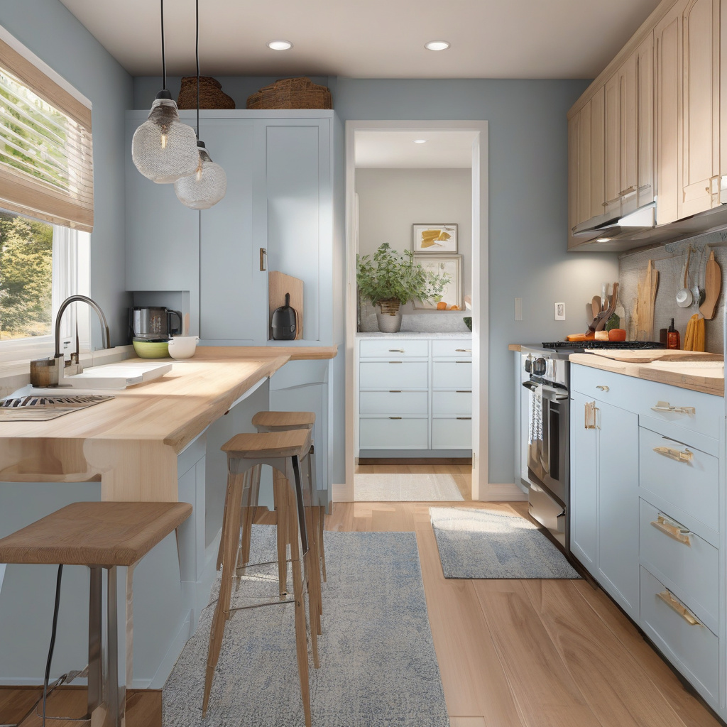
Harnessing the Beauty of Neutrals
Neutrals have always been a safe bet for creating timeless interiors. In Los Angeles, where the sun often blesses homes with abundant light, airy hues such as soft whites and cool beiges are in high demand. These shades serve as the perfect backdrop, reflecting natural daylight and giving small ADUs an unexpected sense of spaciousness and tranquility.
Embracing the simplicity of neutrals can significantly impact the aesthetics and functionality of a compact dwelling. As many renovation experts recommend, the right color palette can transform a cramped corner into a peaceful sanctuary, making it the ideal spot for relaxation or creative work.
Adding layers through varied textures and materials further amplifies the neutral tone’s effect. Homeowners often integrate reclaimed wood, soft textiles, and minimalist decor to complement the neutral palette, subtly infusing character and warmth into their living areas.
Ultimately, embracing a neutral palette enhances not just the visual appeal but also contributes to a soothing atmosphere. It invites versatility, allowing residents to refresh their space with minimal effort whenever inspiration strikes.
Choosing neutrals offers more than grace; it provides a flexible canvas that reflects the natural beauty of the Los Angeles landscape.

The Allure of Soft Greens
Soft green tones are increasingly favored in Los Angeles ADU interiors. These hues, reminiscent of the lush California flora, bring the essence of the garden indoors. They not only amplify the freshness of a living space but also imbue it with a calming energy crucial for urban living.
Green, in its many shades, speaks to resilience and transformation—key themes for urban dwellers seeking solace in compact residences. Light sage or mint shades often feature in kitchens or bathrooms, offering a fresh, crisp ambiance conducive to both culinary creativity and relaxation.
As one might imagine, integrating green into an ADU is more than a decorative choice; it’s a lifestyle decision. It reflects an intention to cultivate tranquility and harmony, tapping into the restorative power of nature within the comfort of one’s home.
Importantly, these shades pair beautifully with other natural elements. Consider wooden furniture or copper fixtures as delightful accompaniments to a green palette, each enriching the space’s organic allure.
Soft greens bridge the gap between home and garden, establishing a continuity appreciated by homeowners prioritizing tranquility.

Warm Clay Tones Bring Earthy Warmth
Lovers of rustic charm often turn to warm clays—earthy reds, terracottas, and browns. These shades, deeply rooted in Southern California’s landscape, impart a subtle vibrancy that transforms ADUs into welcoming retreats.
Whether it’s a baked terracotta kitchen backsplash or a subtle cinnamon accent wall, these warm hues evoke the warmth of the Southwest, blending seamlessly with outdoor patios or lush backyard escapes. Introducing clay tones is a sophisticated way to embed a sense of place within a home.
Such shades evoke nostalgia and warmth, reminiscent of sunlit deserts and red clay canyons. The rich palette encourages a relaxed, cozy atmosphere, ideal for relaxing with a book or hosting an intimate gathering.
More than an aesthetic choice, warm clay hues symbolize a growing trend to reject stark minimalism in favor of spaces that tell stories through texture and warmth. When paired with the right furnishings, they can create a cohesive look that is both fresh and grounded.
Warm clay tones connect interiors with the tangible beauty of a Los Angeles sunset, creating an ever-present reminder of California’s rich and varied terrains.
Research shows that using warm colors can increase the perception of space by up to 30% in compact areas.

Comparing Design Decisions: Risks vs Rewards
Choosing the right color scheme involves balancing aesthetic desires with functional needs. For instance, while dark colors might seem appealing for their dramatic effect, they often make small spaces feel cramped and unwelcoming. Conversely, lighter palettes may require frequent cleaning and maintenance.
Here, some might face decision paralysis, particularly when confronting the myriad of options available to modern renovators. Consulting with design experts frees most from this gridlock, offering tailored solutions that align individual styles with practical living.
Consider the cost implications: bold colors may initially appear budget-friendly, but staying updated on current accent trends ultimately involves ongoing spruces to maintain a cohesive look, impacting overall renovation expenses.
Furthermore, the emotional payoff of color choice is significant. A well-chosen scheme enhances the inhabitant’s mood, fostering productivity, relaxation, or social interaction—key factors in a balanced, enjoyable home life.
Understanding these principles helps in making informed decisions that harmonize beauty and functionality. Ultimately, creating a serene yet stimulating environment empowers each homeowner to achieve a beautiful balance.
| Aspect | Neutral Palette | Bold Colors |
|---|---|---|
| Visual Impact | Calming and timeless | Vivid but potentially overwhelming |
| Maintenance | Low-maintenance | Can require frequent updates |
| Cost | Variable but tends to be cost-effective | Initially lower but potentially higher long-term |
| Emotional Impact | Promotes relaxation | Energizing but possibly anxiety-inducing |
Material Considerations: More Than Meets the Eye
Material choices are pivotal in conveying the full potential of ADU color schemes. Here, textures play just as crucial a role as hues themselves. Selecting surfaces that enhance light reflection can dramatically alter the perception of a room’s dimensions.
Luxe finishes, such as satin and matte, interweave high-end elegance with practical wearability, transforming everyday maintenance into an afterthought. Homeowners often ask, how do paint choices and materials impact performance? The question reflects an increasing awareness of durability and resource efficiency alongside aesthetic aims.
For example, environmental sustainability remains a household priority, with many favoring materials that reflect eco-consciousness while maximizing longevity. Using responsibly sourced materials can significantly increase not only a home’s market appeal but also its alignment with many homeowners’ values.
Modern ADUs continue to innovate through material technology, balancing traditional craftsmanship with modern design sensibilities, ensuring style and substance coexist peacefully.
Proper material selection amplifies a color scheme’s effectiveness, delivering an inviting facade underpinned by durability and function.

Incorporating Exterior Influences
Designing an ADU involves not just interior harmony but also acknowledging the cultural and environmental context of Los Angeles. As such, selecting a palette that reacts positively with exterior elements like garden foliage or nearby architectural landmarks enhances visual cohesion.
Strategically placed windows and doors enable interiors to bask in outdoor beauty, often blurring the boundary between indoor warmth and outdoor vibrancy. Selecting the right exterior paint brand before finishing up an interior upgrade can further synchronize these spaces.
For homeowners seeking to make informed choices, exploring quality exterior paint recommendations helps tie the various design elements together, creating an ADU that is not only visually appealing but also part of the landscape’s broader narrative.
A notable aspect of this integration lies in careful planning and execution, where creativity meets craftsmanship. Stamped walkways, verdant landscapes, or intricate pergolas often anchor these design elements, creating seamless transitions that extend a home’s living space.
Integrating exterior influences ensures a holistic approach to ADU construction, showcasing a thoughtful fusion of internal aesthetics and external influence.
Industry expert Jane Masterson states, “Creating a cohesive ADU involves balancing visual harmony with functional elegance, a challenge well met by California homeowners.”

Navigating Trends for Personal Expression
Ultimately, an ADU’s most significant design opportunity lies in expressing the homeowner’s personal taste. Within Los Angeles’ dynamic backdrop, individuality reigns supreme, reflecting diverse character within each dwelling’s footprint.
By considering factors such as habitual use and desired atmospheres, designers craft personalized spaces that cater to their residents’ unique lifestyles. Whether through bold feature walls or subtle accents, every design choice should resonate with those who inhabit the space.
Furthermore, the eclecticism prevalent within larger Los Angeles allows design conventions to remain fluid, encouraging creativity while respecting the city’s distinctive style. Regular updating as new inspiration emerges becomes an integral part of sustaining authenticity and relevance.
Color choices, textures, and layouts coalesce into a cohesive vision, where imagination guides development. Empowered by their environment, homeowners find ample room to convey their narratives through strategic color and design elements.
Personal expression through ADU interior design encapsulates the essence of dwellings, showcasing Los Angeles’ audacious yet sophisticated flair.
A study from the Home Renovation Institute suggests that homes with unique, personalized interiors see a 20% increase in resale value.
In conclusion, designing ADU interiors in Los Angeles is about capturing the essence of open, flexible, and harmonious living spaces. Colors reflect both the homeowner’s personal story and the broader cultural movements of Southern California, offering a canvas that conveys comfort and innovation with each brushstroke.
- Neutral colors create a versatile, serene atmosphere in small spaces.
- Soft greens offer a natural extension from indoor to outdoor living.
- Warm clay tones accentuate coziness and warmth.
- Material choices enhance color schemes and reflect sustainability.
- Personal expression in design reinforces visual and emotional harmony.
“`html
FAQ
What are the most popular color palettes for ADU interiors in Los Angeles?
In the diverse and vibrant landscape of Los Angeles, ADU interiors often gravitate towards airy neutrals, soft greens, and warm clays. These colors not only amplify the natural light but also create a serene and harmonious setting that seamlessly connects the indoors with the outdoor backyard. Designers frequently stress the importance of using light-colored palettes in compact spaces to enhance openness, making these choices ideal. In my experience, a three-room ADU I renovated in downtown LA used shades of pale olive that brilliantly tied the space to the surrounding gardens. Such thoughtful color selections truly make a difference in expanding the perceived boundaries of small dwellings.
How can I choose the right paint colors for a compact ADU space?
Choosing the right paint colors for a compact ADU space is all about balancing three elements: lighting, function, and mood. Begin by observing the natural light at different times of the day as it influences color perception. For instance, soft greens can transform with evening light, offering a soothing atmosphere ideal for relaxation. Think about the primary purpose of each room. Kitchens might benefit from energizing yet subtle hues like clay, while bedrooms might need calming tones. Many homeowners mistakenly ignore ceiling colors, but a slight tint can impact room height perception. This nuanced approach enhances both function and aesthetics harmoniously.
When does it make sense to renovate an ADU with these color choices?
The timing for renovating an ADU can greatly influence the impact of your chosen color palette. Ideally, you’d plan updates during periods of lower humidity and less activity in your backyard spaces. It especially makes sense to consider these colors if you’re aiming for a home office or a guest suite atmosphere that is both welcoming and engaging. Homeowners in transitional neighborhoods like Silver Lake have successfully captured modernity with these serene tones, bridging design and the Southern Californian aesthetic. Inevitably, the right timing for renovation ensures less disruption and maximizes color longevity.
What mistakes do homeowners commonly make with ADU interior colors?
A frequent mistake is failing to account for how colors shift with different lighting throughout the day. What appears as a peaceful cream in daylight might turn into a dull beige at night, losing its vibrancy. Often, homeowners choose colors without testing swatches in their specific environment, which can lead to dissatisfaction. Another error is overcomplicating the palette; combining too many colors can make a small space feel cluttered and disconnected. By staying within a cohesive range of airy neutrals, soft greens, and warm clays, you achieve both simplicity and elegance.
What are the cost considerations when choosing ADU interior colors?
Cost considerations for ADU interior colors go beyond paint prices. While superior paint options may require a larger initial investment, they often offer enhanced durability and less frequent need for touch-ups, saving costs in the long term. Many overlook the expense of professional color consultations, yet these can prevent costly mistakes by ensuring color harmony. Another consideration is coordinating with existing furnishings; reupholstering pieces to better match new tones can add to expenses. Nevertheless, strategically choosing colors that maximize natural light can reduce the need for artificial lighting, subtly lowering energy bills, a benefit often highlighted by veteran renovators.
What are the pros and cons of using airy neutrals in ADUs?
The use of airy neutrals in ADUs has its advantages and limitations. On the pro side, these colors create a sense of spaciousness, which is crucial in smaller areas. They act as a versatile backdrop, allowing for flexible decorating changes over time. However, on the downside, airy neutrals can sometimes appear cold or bland if not paired with textures or accents. They also require more frequent cleaning as dirt and wear become more visible. Yet, by skillfully adding elements such as vibrant artwork or textured textiles, you can mitigate these drawbacks, achieving both style and practicality.
What is the relationship between ADU interior colors and outdoor landscaping?
The interplay between ADU interior colors and outdoor landscaping is a cornerstone of cohesive design. Many experts emphasize ensuring that the interior palette complements the surrounding environment. For instance, soft greens inside can beautifully echo the lushness of a well-maintained garden, creating a seamless flow between spaces. Conversely, failing to align these elements can cause a disjointed feel. A thoughtful approach, like matching the earthy tones of patio stonework with indoor warm clays, creates a unified aesthetic that feels organic. This strategy not only maximizes visual appeal but strengthens the connection to nature, often treasured in Los Angeles living.
How can I coordinate ADU interior colors with existing backyard features?
Coordinating ADU interior colors with existing backyard features involves a keen eye for balance and harmony. Begin by observing the fixed elements in the yard, such as fencing, paving stones, and dominant plants. Suppose you have a rustic wooden fence; warm clay accents inside can enhance this natural wood, creating cohesiveness. Soft greens might echo the foliage, making indoor and outdoor intertwine effortlessly. Tackling coordination early on is crucial, and if you need personalized assistance, you might want to check this contact page for guidance, as local experts can provide tailored insights specific to your neighborhood’s unique aesthetic.
“`