When it comes to transforming your home, a fresh coat of paint can work wonders. Yet, choosing the right hue is more art than science, especially when contending with Southern California’s varied lighting nuances. Before you commit to gallons of paint, it’s crucial to know how your selected colors will harmonize with your space. Here’s how to test paint colors effectively in your Los Angeles home to avoid costly and time-consuming mistakes.
Brief summary: Successfully choosing paint colors involves testing with sample boards, observing changes under different lighting conditions, and understanding the interaction of color with your home’s architecture. This guide explores the strategic considerations and steps homeowners in Southern California should follow to achieve the perfect finish.
Understanding the Power of Sample Boards
Local Los Angeles homeowners often face a common dilemma: colors that seemed perfect in the store appear drastically different on their walls. This is where sample boards save the day. These portable canvases allow you to test potential colors without committing them directly to your walls.
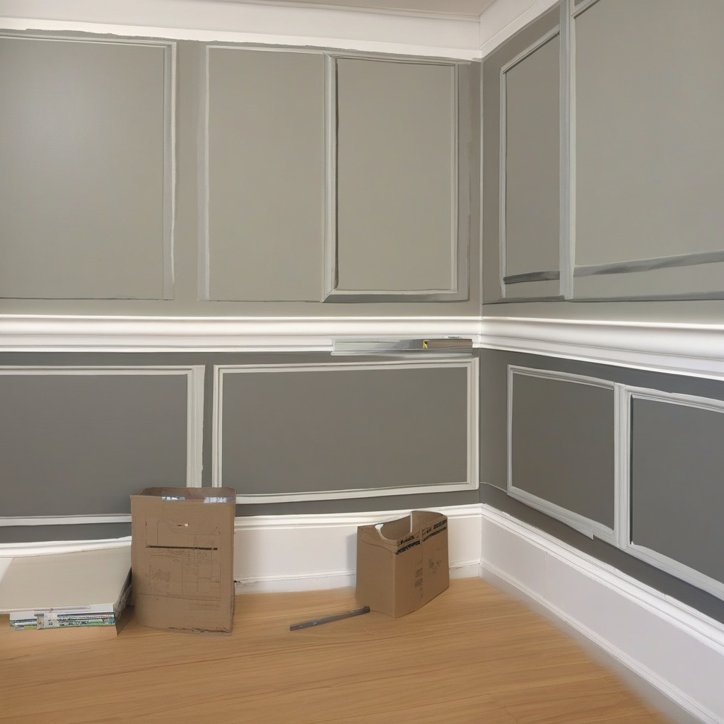
Begin by painting large swatches on a board that you can move around your space. As exploring local painting techniques will reveal, the idea is to expose colors to varying ambient light conditions. Be sure to apply a generous layer to ensure opacity and richness.
Relocate your sample boards throughout the day—from the dim glow of morning to the stark brightness of midday—capturing different lighting moods. Many homeowners find this approach invaluable, as colors can shift dramatically based on their surroundings. It’s a system that echoes the experimental yet controlled methods of renowned architectural redesigns.
When used correctly, sample boards can guide crucial decisions early, preventing regret and additional costs later. They bring the abstract to life, providing a tactile representation of your vision that sees you through daily rhythms.
Dealing with Southern California Light Variations
In a city blessed with abundant sunshine and diverse architectural styles, Los Angeles presents unique challenges and opportunities in terms of paint color selection. Paints appear differently depending on the interplay of light and architecture. This can complicate your color selection process.
A common pitfall is underestimating how sunlight sharpens or dulls colors. For instance, a warm beige may turn golden under intense afternoon sun, while a demure gray might wash out entirely. The creation of an intentional light effect demands an understanding of natural sunlight patterns and local quirks.
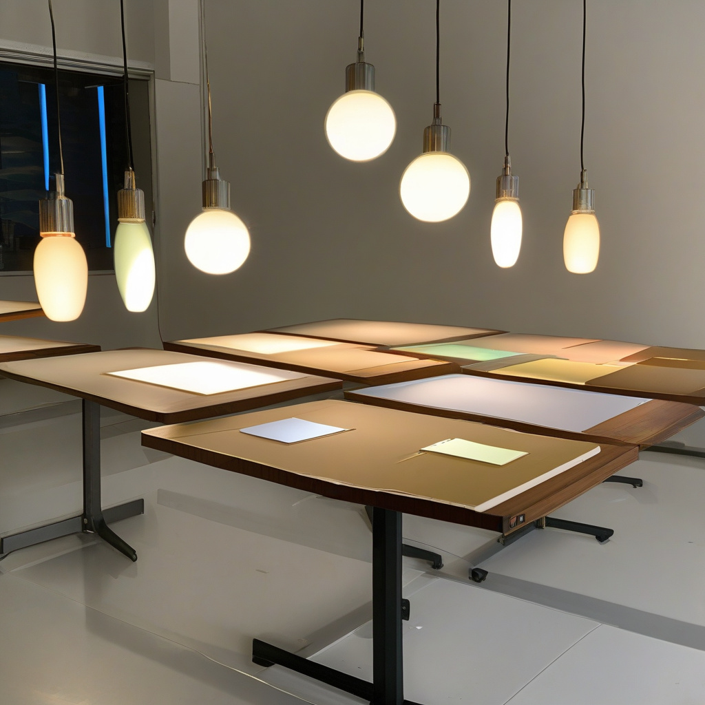
Employ both natural and artificial light in your assessments. Use lamps at various distances to discern how colors hold under indoor lighting. These structured assessments echo insights from professional designers who stress the importance of thorough planning before choosing a color palette.
Indeed, this learning experience lays the groundwork for more sophisticated decisions and enhances your appreciation for subtle color dynamics. By testing under all possible lighting scenarios, you can confidently navigate the local renovation landscape.
Let’s Talk About Commitment: The Temporary Patch Approach
If a full-wall treatment feels too permanent, the temporary patch method may suit you. This approach, championed by renovation experts, involves painting smaller squares directly onto walls at strategic spots to better assess color interaction.
Unlike sample boards, these patches provide an immediate glimpse into how paint behaves with existing shades, textures, and room’s size. Consider how paint works with other elements, such as furniture or art pieces, which play a significant role in the final look.
Real-world application techniques involve layering different test patches side-by-side to evaluate contrasts and harmonies. Think of them as mini-projects—a safe space for trial and error that enables you to make informed decisions in choosing final colors.
A Painting and Decorating Association study found that “85% of homeowners express greater satisfaction when trialing paint samples first.”
The temporary patch practice thus offers a clear picture of potential outcomes, allowing you to step back and creatively visualize the finished room without overwhelming fear of irreversible decisions.
Choosing the Right Minimalist Palette
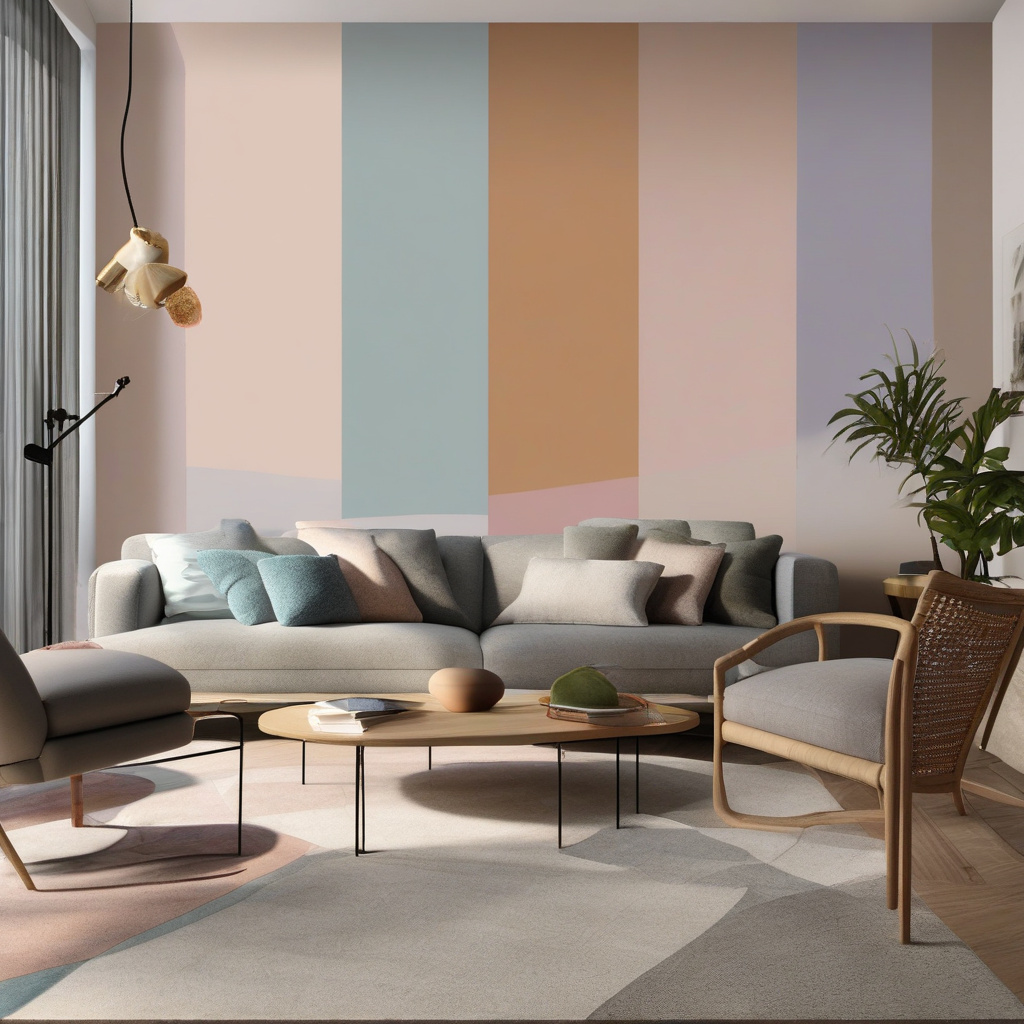
Many Southern California dwellers explore minimalist palettes that promote relaxation and timeless elegance. During the planning stages—a crucial moment to consider minimalist paint strategies—a minimalist approach represents a versatile and chic option.
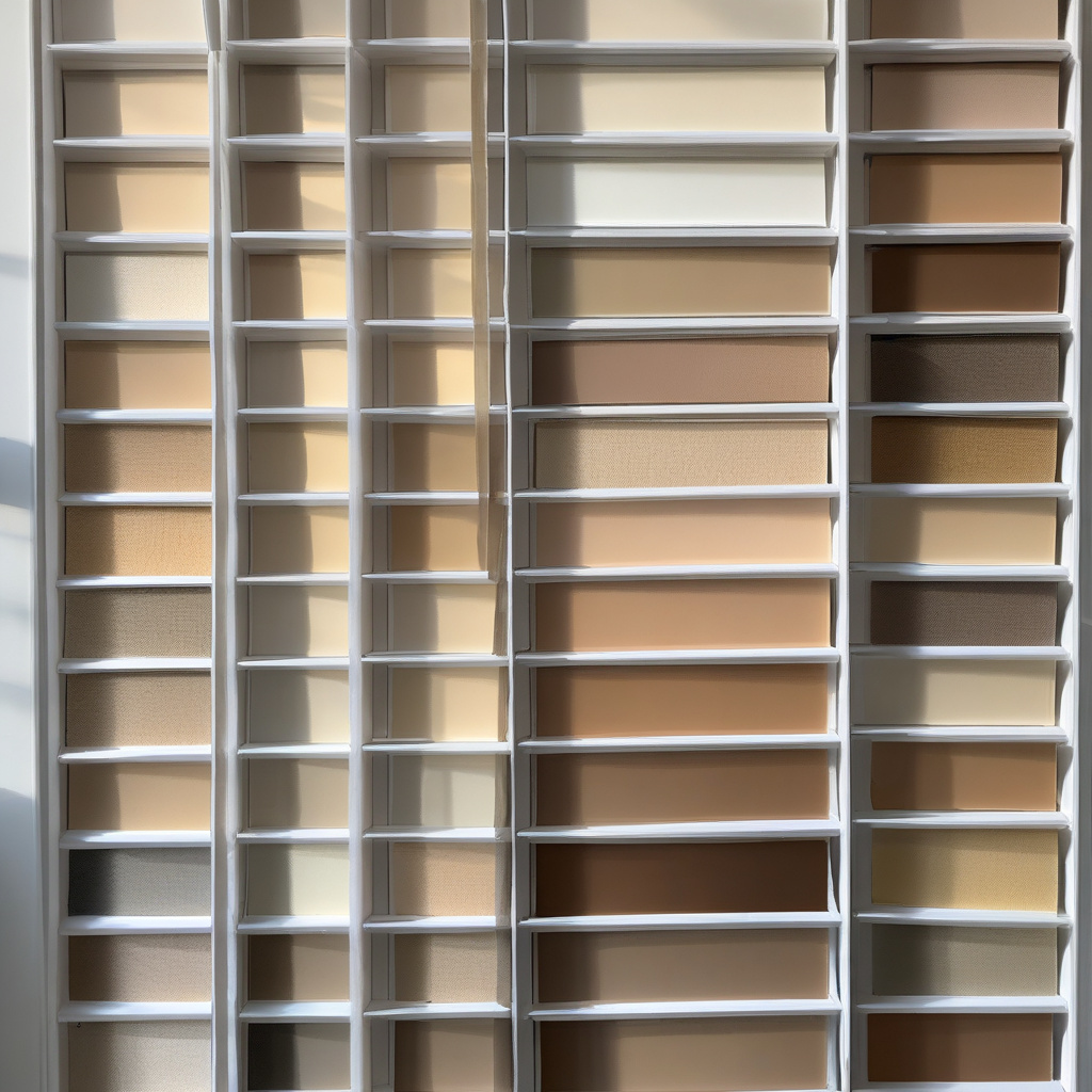
The stripped-back aesthetic doesn’t forfeit variety; instead, it uses subtle shifts in tone and texture. Whites and neutrals often form the base, and gentle accent colors are added to infuse character without overwhelming the senses.
Factors Influencing Minimalist Paint Choices
The freely flowing natural light of Southern California enhances these choices, as muted shades steamroll any harshness. The result is an atmosphere that thrives on light yet delivers bold statements through discretion and restraint.
Functionality is at the core of this design tactic. It considers the practical aspects of daily living while enhancing the room’s functionality and aesthetic coherence. This ensures the space remains inviting but unmistakably refined.
Architectural Digest notes that “minimalist spaces increased property value by 7%, owing to their broad appeal.”
Embracing minimalism demands bravery and commitment; however, its results are unmistakable in providing a clean backdrop that adapts beautifully to your evolving style preferences, favoring harmony over frenetic layering.
Weighing Costs and Materials
When tackling home renovations, understanding cost and material nuances is crucial. Paint offers a more budget-friendly solution compared to other renovations like replacing cabinetry. The question remains: is painting more pragmatic?
Costs associated with painting can range distinctly, influenced by type, finish, and brand reputation. Where some paints ensure resilience, others emphasize eco-friendliness or ease of application. Align purchases with personal priorities—whether durability or non-toxicity.
Paint vs. Replace: Financial and Practical Considerations
A refreshing paint job can mask cabinet wear, saving significant expenses that a complete replacement incurs. Alternatively, where structural damage is severe, replacement might be warranted. This key decision can impact overall budget allocation for other elements, from textiles to custom cabinetry.
Through evaluating feasibility, durability, value extension, and aesthetic returns, you lay a smarter road to material selection and priority setting—ensuring seamless integration with broader renovation objectives.
| Option | Cost Estimate | Average Timeline |
|---|---|---|
| Painting | $200 – $800 | 2 – 3 days per room |
| Replacing Cabinets | $5,000 – $15,000+ | 1 – 2 weeks |
In contemplating the merits of painting over structural modifications, consider holistic returns on investment, recognizing every renovation stage adds depth and value to your living experience.
From Sample to Reality: Implementing the Right Whites
Crafting the perfect modern haven often starts with selecting the ideal shade of white. Whites, long synonymous with versatility and sophistication, also form the canvas upon which Southern Californian interiors shine.
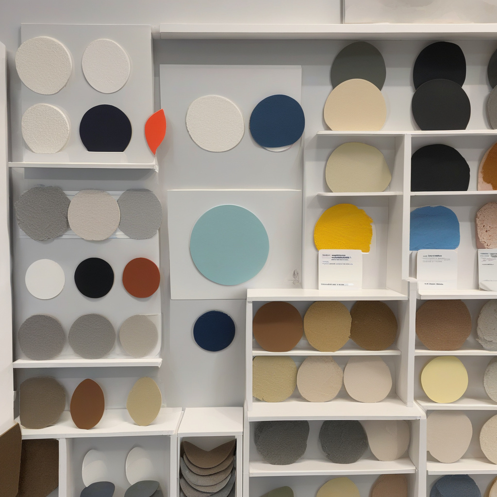
The challenge lies in transforming swatches into lived-in spaces that reflect not only personal aesthetic but also functional demands. This necessitates a seamless transition from sample to wall, ensuring that what you previously scrutinized is now a harmonious part of your home.
Achieving this begins with research and guidance. By accessing insightful resources like locally preferred white shades, you arm yourself with the knowledge necessary to make informed decisions that resonate with sought-after innovation and creativity.
Finally, always reflect on potential adjustments, understanding that spaces evolve, demanding both adaptability and ongoing reflection of your own tastes and aspirations—key components of any successful renovation endeavor.
An industry survey by Houzz revealed that “64% of homeowners seek professional advice when finalizing paint choices.”
At the end of your paint journey, remember that study and consultation empower your decision-making, combining expertise to satisfy both current needs and future ambitions.
- Experiment with color samples using boards and patches to prevent commitment failures.
- Consider how Southern California sunlight affects each hue within your home.
- Use minimalism and strategic layering for timeless, versatile home styles.
- Acknowledge the cost benefits of painting versus replacing for budget-friendly updates.
- Embrace local insights for picking the best white shades and other neutrals.
FAQ
Why is testing paint colors in your home important before committing?
In real renovation projects, it often becomes clear that the paint color you love in a hardware store or on a small swatch can look vastly different on your walls. The interplay of natural and artificial light, existing furnishings, and room size can all alter your perception of a color. Testing paint with sample boards or temporary patches allows you to see how the color morphs throughout the day, providing you with confidence in your final choice. Skipping this critical step can lead to an unsatisfactory hue that doesn’t align with your vision or the room’s purpose.
How should you choose which paint colors to test?
Many experts point out that selecting paint colors should start by considering your existing decor and the mood you want to establish. Begin with a few base colors that appeal to you and appear compatible with your furnishings. You should also consider the undertones; a color that seems neutral on paper can have hints of blue or yellow in real settings. To avoid the common mistake of matching colors strictly by their names, view them next to fabric samples and create a mood board to visualize the overall design. This level of planning prevents the frustration of discovering mismatched colors after the paint has already dried.
When is the best time to test paint colors in your home?
Homeowners frequently underestimate this aspect, but the best time to test paint colors is over the course of several days, spanning both sunny and overcast conditions. Paint often behaves differently from morning to evening due to shifting light sources. A color that feels warm in the glow of sunrise can appear entirely different under the coolness of night lights. You should devote time to observing how the chosen patches transform during the week; this is particularly important in rooms with varying light exposures. Patience in this process guards against hasty decisions that often result in additional expense.
What are typical mistakes to avoid while testing paint colors?
A frequent mistake is applying test paint directly onto existing colored walls, which can alter your perception due to undertone interference. Instead, use a white primer or test boards to achieve accurate results. Another common error is testing small patches, which limits your ability to envision the color over a larger surface area. Finally, failing to label your test areas can create confusion, leading to second-guessing your preferred shade. Being systematic and thorough in your testing approach empowers you to make the most informed decision.
What are the cost considerations for testing paint colors?
When considering the budget, paint samples may seem like an added expense but are vital for avoiding costly mistakes. Sample pots are relatively inexpensive compared to the cost of repainting an entire room that doesn’t match your expectations. Moreover, many hardware stores offer sample-sized paints at a fraction of the price, which can save you from buyer’s remorse. While some may view testers as an additional cost, seasoned renovators appreciate this investment for its potential to ensure satisfaction and preserve your overall renovation budget.
What are the pros and cons of using sample boards versus painting on the wall?
Sample boards offer a portable way to shift colors around the room, helping you test in varying lights and compare against different decor elements without damaging existing walls. However, some argue that on-wall testing provides a more authentic preview. The downside of wall tests is that they can be labor-intensive to clear if you decide against a color. A practical approach combines both methods, allowing you to view the paint in multiple contexts. This balanced practice can offer comprehensive insights without locking you into a premature decision.
Are there any limitations to testing paint colors in a home?
Despite their utility, paint tests have limitations. Small sample areas might not fully encapsulate how a color will envelop an entire room. Additionally, lighting variations in sample boards versus an entire wall’s natural exposure can skew results. Weather also plays tricks—seasonal changes can make windows let in more or less light, creating inconsistencies. Even then, testing remains invaluable; failing to test at all presents far greater risks of dissatisfaction. Thus, it is prudent to acknowledge these boundaries and proceed with a mindful testing strategy. If you’re seeking local expertise on this matter, consider looking into the insights provided by experts in your area through a comprehensive consultation.
How does color testing differ in new builds versus older properties?
In newer builds, standardized lighting and neutral wall prep often result in predictable outcomes when testing paint colors. Conversely, older homes present unique challenges with varying wall textures, historical paints, and more fluctuant light patterns due to smaller windows. This requires a more tailored approach to testing, taking into account these dynamics and how they may influence the color on your walls. These factors suggest the need for older homes to employ a wider array of test samples to gauge potential shifts comprehensively. It often helps to enlist seasoned professionals who understand these nuances to guide your decision-making process effectively.