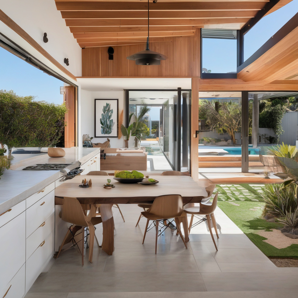
Imagine this: You’re walking through a sun-drenched neighborhood in Los Angeles, where the homes echo the kind of charm that makes Instagram feeds sing. You glance up and notice a newly constructed addition sticking out like a sore thumb. Such visual discord can be painfully avoidable, yet it persists as one of the most common renovation missteps. As you consider expanding your own home, it’s crucial to ponder how to seamlessly blend old with new. More than just an art form, choosing exterior colors for a new addition demands an understanding of undertones, texture contrasts, and the capricious nature of sunlight.
Brief summary: This article explores how to select exterior colors that align with existing home structures. It delves into matching undertones, evaluating textures, and understanding how sun exposure impacts color perception, ensuring remodels perfectly merge with their surroundings. Real-life insights and expert opinions from Southern California serve as guiding lights.
Understanding the Context of Your Home
When embarking on a renovation journey in Southern California, particularly Los Angeles, it’s essential to first grasp the unique context of your home. Los Angeles is no stranger to architectural flair, but this creativity must be balanced with the existing character of the neighborhood. The aesthetic of a new home addition should harmonize with what is already there, almost as if the whole structure were orchestrated in a single, graceful movement. Homeowners here often start by consulting resources such as local renovation guides to better understand their new project within the tapestry of their neighborhood.
Matching colors is more than a surface decision; it takes understanding the materials of both the new and the existing sections of your home. Think about the statement you want to make—bold or understated—and how it aligns with the rest of your home. While some opt for an autumnal palette to echo the golden glow of LA sunsets, others are seduced by coastal blues that whisper oceanic tales.

Many local homeowners note that while certain colors seem flawless at the time of selection, they can shift dramatically after a few days baking under the unyielding California sun. Therefore, sun-response behavior is an essential aspect to factor in early in the planning stage.
“In sunny areas like Los Angeles, light interacts with homes differently, making careful consideration of shades and tones indispensable,” notes Mark Hanley, a renowned architectural color consultant.
For a seamless appearance, remember to consider everything from how your house is oriented relative to the sunlight, as well as seasonal changes that might affect the colors’ appearance.
Matching Undertones: The Silent Heroes
When people talk about color matching, they often refer to the visible, bold colors. Yet, there’s a subtler aspect in play: undertones. These are the colors lurking beneath the surface, affecting the way primary colors are perceived. Consider your house as having its own personality—one that speaks through soft whispers of undertones rather than the loud declarations of primary colors.
Understanding the essence of undertones involves a deeper dive into the science of color, where things aren’t always black and white—literally or figuratively. For instance, a red paint might carry a blue undertone, altering its apparent warmth. When thinking about the blueprint of your addition, recognizing these undertones can prevent unnecessary clashes that upset your home’s harmony.

Professional advice is invaluable here. An inspection of paint swatches at different times of the day gives a clearer understanding of how they interact with light, a key consideration when making these subtle yet impactful choices.
“Homes are like people—complicated, layered, and ever-changing. Seamless color integration recognizes and respects that complexity,” asserts Josephine King, a Los Angeles-based architect.
Once undertones are acknowledged, the color selection becomes a nearly intuitive process, crafting an addition that’s both distinct and cohesive.
Selecting and Testing Paints
Understanding undertones equips you for the next vital stage: selecting and testing paints. While the color wheel is vast and varied, confining your options to what harmonizes with your existing setup can save a world of trouble down the line. Los Angeles homeowners have a penchant for colors that invoke feelings or memories—be it the tranquil green of Griffith Park or the vibrant red inspired by salsa-dancing afternoons.
Before making a decision, sample a small area on the exterior wall achievable by using paint samples or swatches, allowing you to visualize the color’s outcome against existing segments. Observations from early adopters have shown it’s not uncommon for several rounds of tweaks until the ideal shade is discovered.
Including visual aids like  in your renovation toolkit might seem trivial but can make a colossal impact. The interconnection between the chosen hues and natural elements, such as the surrounding vegetation or the sidewalk, contributes to crafting a pleasing composition.
Statistic: According to 2023 design insights, 87% of successful home renovations incorporate exterior color choices that were field-tested under varied lighting conditions before finalizing.
Execution then transforms into an art form itself, with paint brushes dancing under the skilled guidance of anticipation.
Considering Texture and Material Contrast
As colors and textures interplay, homeowners may wonder: How does the combination of different materials affect the final look of my renovation? Here, it is not just about color but how texture and materials enrich the narrative of your home.
Engaging with professionals can be beneficial as they often suggest innovations achieved through materials that blend stylistically with those already present. This stage might involve pivoting back to discussions on design methodologies that examine material impact in depth.

| Aspect | Material A | Material B |
|---|---|---|
| Cost | Moderate | High |
| Durability | 5-10 years | 10-15 years |
| Aesthetic Appeal | Contemporary | Classic |
| Maintenance | Low | Moderate |
Strategic material use doesn’t just add robustness—it aesthetically enriches a structure, complementing existing textures and personalities of older parts.
Risks vs. Rewards of Exploring New Hues
With endless color possibilities, the question arises: Is it worth stepping away from traditional colors to explore more contemporary options? The allure of painting an addition with an unexpected splash is tempting, though not without potential pitfalls.
Steering into unknown territory risks dissatisfaction if your choices date quickly, yet it could elevate your home to a landmark, with neighbors recognizing it as a stylistic triumph. The beauty of Los Angeles’ diverse architectural fabric is that it tolerates and even thrives on such controlled risk-taking.
Implementing new colors can breathe life into worn structures, yet caution must be applied relative to municipal guidelines on egresses and colors which can be further researched through sources such as recommendations on building codes and standards.
“While adventurous color choices can rejuvenate, they should never overpower or disregard the innate character of the home,” advises architectural historian Dr. Eliza Warren.
Thoughtful execution and a sprinkle of boldness might lead to unexpected joy both for the inhabitants and onlookers alike.
Steps for Achieving Harmony: A Mini How-to
Now envision a strategy that not only inspires but ensures a successful exterior color integration. Begin with acknowledging your home’s existing hues and recognizing their effect on surroundings. Test shades under different conditions to account for natural lighting effects throughout the day.
Move on to carefully scrutinizing undertones and textures, opting for combinations that calmly translate your home’s intended narrative. Utilize advice from professionals who loudly champion the cause of holistic design strategies.
Finally, expand your color exploration by balancing classic and contemporary tones without exceeding style limitations, engaging local expertise while savvy to fiscal considerations.

In conclusion, outward harmony requires inner reflection—fuse these strategic steps, and let your home sing.
- Begin with an understanding of your home’s current color scheme and establish a dialogue between it and your renovation.
- Evaluate and acknowledge the significant influence of undertones and lighting conditions.
- Engage in rigorous testing of prospective colors under various environmental settings.
- Opt for materials that support and accentuate your color choices, considering their texture and durability.
- Balance traditional with modern hues, taking calculated risks to refresh your expanded home’s spirit.
“`html
FAQ
How do I choose exterior colors for a new addition to match my existing home?
Choosing exterior colors for a new addition can feel daunting, but it’s all about creating a seamless blend that respects both old and new. Start by examining the undertones of your existing home. In many renovation projects, the subtle hues in paint can make or break unity. For instance, if your home has a cool grey tone, incorporating a warm beige on the addition could clash visually. Explore texture differences, such as brick against siding, as these can influence color perception. Pay attention to how sunlight interacts with the colors at different times of day; what looks good in the morning might appear stark under midday glare. Remember, it’s not just about replicating the exact color but rather ensuring that the overall visual feel is harmonious.
What are the common mistakes homeowners make when matching home exterior colors for an addition?
Homeowners frequently underestimate the impact of light on color. A shade chosen in a paint store might transform under natural light conditions. Additionally, ignoring the role of surrounding structures and landscaping can lead to jarring contrasts. Another pitfall is neglecting to test paint samples on site; real-world renovation insights show that what appears harmonious on a sample board might not translate to a larger facade. Lastly, mismatching textures without considering color absorption rates can result in uneven appearance, where one surface might look significantly lighter or darker than the other.
When does it make sense to repaint the entire home instead of matching the addition to the existing color?
Opting to repaint the entire home is often wise when the existing paint is aging, fading, or if the original shade is discontinued. In projects where the main structure has endured years of sun exposure, colors may have significantly dulled, making a precise match impossible. Moreover, if the expansion dramatically alters the home’s proportion, a unified color can redefine its identity. Although the initial investment is higher, homeowners find that it improves not just aesthetic appeal, but also potentially enhances property value. In California, where home styles evolve, refreshing the color pallete can contemporize a property amidst modern builds.
What are the cost considerations for matching colors on a home addition?
Cost varies based on materials, design complexity, and the size of the project. Simple matching can be economical; however, achieving perfect color replication might mean custom paint mixes or high-end finishes. Factor in the cost of labor, especially in California, where skilled painters can command premium rates. Consider long-term maintenance; opting for quality materials may have a higher upfront cost but minimizes future repainting expenses. Working with a renovation expert can offer insights into cost-effective options without sacrificing aesthetic goals.
What are the pros and cons of using the same color and finish for a home addition?
Using the same color and finish ensures consistency and aesthetic cohesion, making the addition appear as part of the original structure. This approach can simplify decision-making and eliminate potential mismatches. On the downside, it can sometimes stifle creativity or miss opportunities for revitalization. There’s also the risk of changes in color batches; even slight variations can be noticeable against older paint. Balancing the desire for uniformity with the opportunity to explore fresh accents can create a subtlity enriched with character.
How do exterior color choices interact with different types of home siding?
Different sidings absorb and reflect light diversely, affecting color perception. For example, vinyl siding might hold paint differently than wood, leading to shifts in color vibrancy over time. In renovation scenarios, new materials might not share weathering characteristics with older structures. This means what matches now may diverge in appearance as time passes. When working with mixed materials like brick and wood, it’s essential to factor in these elements’ reactions to paint and weather conditions. Consulting with an experienced contractor or checking out some tailored advice from a professional can be highly beneficial, especially when your home presents unique architectural features. For personalized guidance, consider reaching out to this helpful resource.
What should I consider regarding sun-response behavior when choosing exterior colors?
Sunlight can significantly alter color appearance, often warming or intensifying specific hues. Consider your home’s orientation; south-facing walls receive more light and might cause colors to fade faster. In California, direct exposure to intense sunlight might require using UV-resistant paints. Many experts suggest observing test patches at various times to assess the behavior under different light conditions. During renovations, it’s often surprising to see how a color that looked perfect under morning light turns strikingly different by afternoon. Balancing aesthetics with functional needs, like durability against UV exposure, is crucial in making the right color choice.
What are some practical tips for ensuring texture contrast works with color choice?
Texture contrast enriches the visual appeal of combined architectural elements. When the texture diverges, the home may exhibit vibrancy despite limited color palettes. For instance, pairing a smooth stucco finish with rustic wood planks can create an eye-catching contrast that yet harmonizes under a unified color theme. In practice, the choice of sheen plays a pivotal role; matte can soften textures, while gloss might highlight them. During construction, always evaluate how surfaces touch and interact under varied lighting. Many homeowners find it useful to employ models or to test samples across different surfaces to predict the overall look and feel.
“`