Color psychology plays a pivotal role in painting choices for spaces, particularly for bedrooms and offices. These personal and professional settings require distinct color palettes to fuel relaxation or productivity. In bustling regions like Los Angeles and Southern California, homeowners and office designers alike turn to color psychology to shape environments that align with their lifestyle and work demands. Understanding the interplay of colors can lead to a more harmonious and efficient living or working space.
Brief summary: This article delves into how color psychology influences paint choices for bedrooms versus offices in the Los Angeles area, examining trends, renovation experiences, and practical advice. Through expert insights and local case studies, it underscores the importance of selecting the right color palette for functionality and mood.
The Science Behind Color Psychology
Color psychology, a fascinating field of study, reveals how hues impact emotions and behavior. Bedrooms, sanctuaries of rest, typically benefit from serene colors like soft blues or muted greens. These tones calm the mind, fostering a peaceful retreat from the city’s incessant pace. In contrast, offices are best enlivened with colors that energize and motivate, such as vibrant yellows or inspiring blues.
The subtle yet powerful influence of color can be observed in various architectural and interior design circles across Los Angeles. Local professionals often draw on historical and cultural color implications to craft spaces that are not only aesthetic but also intuitively functional. This understanding has led to an increased demand for color consultations in design projects.
As with any design decision, the right hue can transform a room while supporting mental and physical well-being. Homeowners frequently report enhancements in sleep quality with the right bedroom colors, while a conducive office setting can lead to greater productivity and creativity. The strategic use of color has quietly become a cornerstone of thoughtful design.
Statistics suggest that choosing the right paint colors for your space is not just a trend, but a science-backed practice gaining momentum among Southern Californians looking to optimize their environments.
Picking the Perfect Palette for Bedrooms
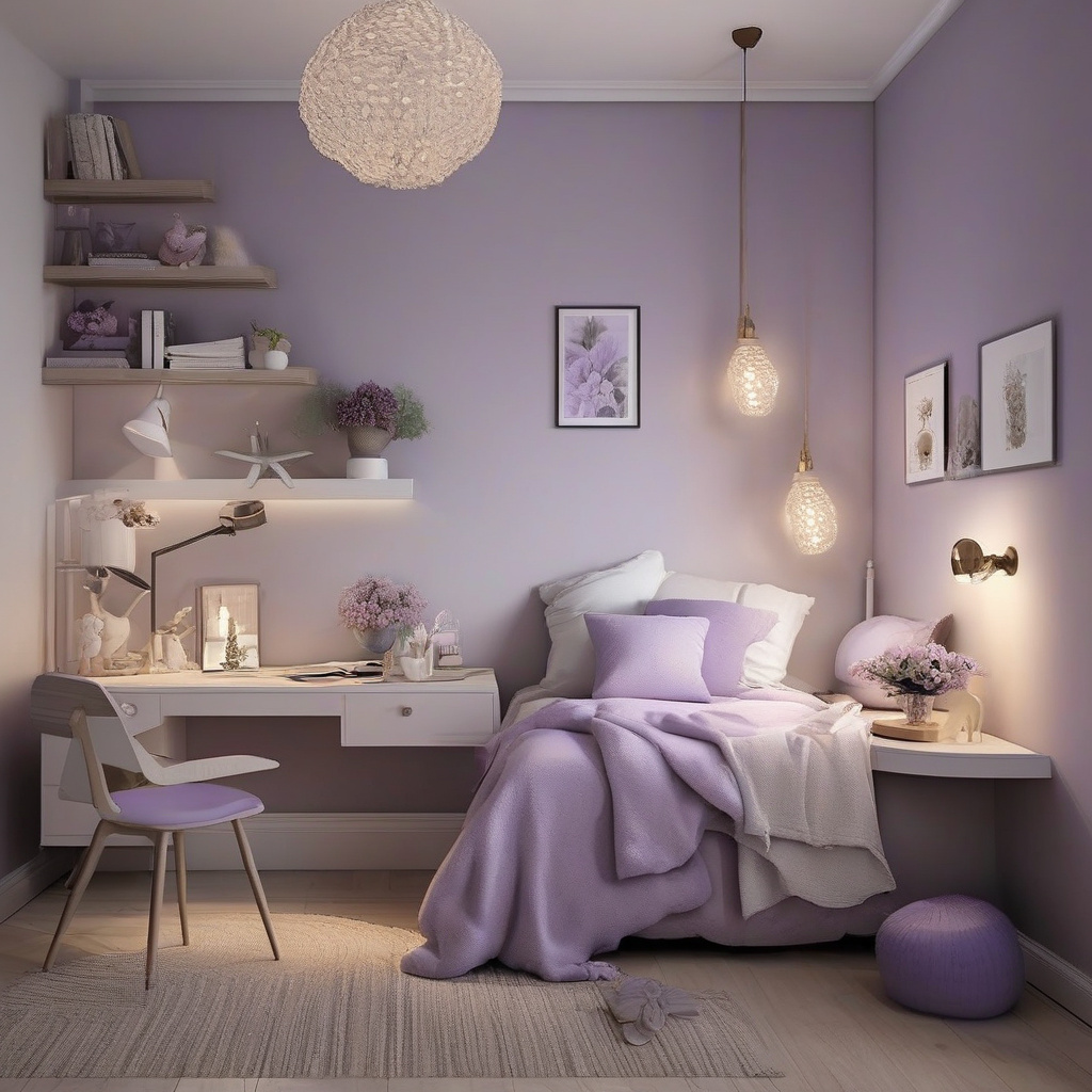
In Los Angeles, a city where the hustle never ceases, bedrooms are personal havens. Many homeowners prioritize creating a soothing environment, and color selection is a critical part of this process. Gentle hues like lavender, pale blue, or even soft earth tones are recommended for imparting calmness and aiding restful sleep.
Personal preferences aside, designers have noted a pattern where these cool tones universally provide a sense of tranquility. They are a welcome retreat from the vibrant life outside, offering residents a peaceful oasis within their homes. Complementary colors in textiles and decor enhance this serene aesthetic without overpowering the space.
The process begins with understanding one’s color preferences and considering the room’s existing natural light. It’s crucial to remember that little changes can drastically alter the room’s ambiance. Consulting with professionals who specialize in color psychology can make the transition smoother and the results more satisfying.
Ultimately, when it comes to bedrooms, the goal is to craft a personal retreat tailored to your own relaxation needs. As many local designers recommend, engagement with the process is as beneficial as the outcome.
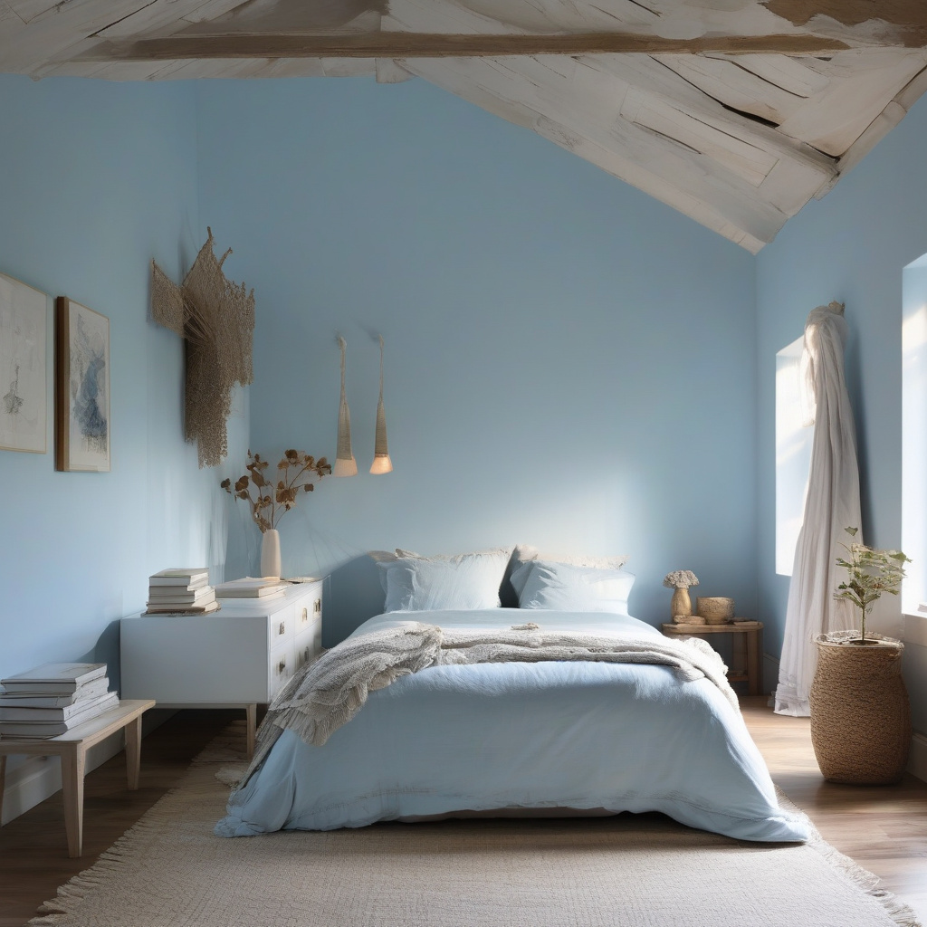
Insights from industry expert: “Selecting a soothing paint color for bedrooms can improve sleep quality and boost overall well-being.”
Crafting a Productive Office Environment
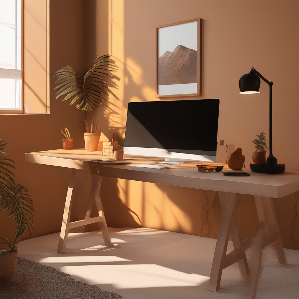
Unlike homes, office spaces demand a different palette to boost efficiency and creativity. Color psychology posits that shades like green and blue can foster focus and clarity, while vibrant colors such as reds and yellows can inspire energy and innovation when used in moderation.
Los Angeles, a hub for innovation and creativity, continuously sees an influx of new office design trends. These often include the adoption of dynamic color schemes that reflect and reinforce a company’s brand and culture. The strategic use of color can enhance collaboration and enthusiasm within the workplace.
The trick lies in understanding the psychology behind each hue and the specific needs of your team. Designing an office environment in Southern California means navigating daylight and often minimal indoor space efficiently. Recognizing the cultural and regional implications of colors can be as critical as personal preference in these shared spaces.
Whether launching a startup or revitalizing a traditional workspace, investing in color psychology can yield substantial gains in morale and productivity. This is a compelling reminder of how impactful color can be in shaping workplace dynamics.
Common Missteps in Color Choice
When planning an office or bedroom design, certain pitfalls can detract from the desired effect. A frequent error is the overuse of bold colors, which can lead to overstimulation and discomfort. The key is to balance bright hues with neutral tones to prevent overwhelming occupants.
Research Note: “A thoughtfully designed color scheme in offices can boost employee productivity by up to 30%.”
The decision-making process should include a blend of professional advice with individual tastes. Reviewing regional trends and expert consultations can help avoid costly mistakes and ensure your space resonates well with its intended function.
Understanding Costs and Materials
Engaging professionals to choose the right color palette is an investment that pays off in spades. In the Los Angeles area, the cost of hiring a color consultant ranges from $500 to $3,000 depending on the project’s scale and complexity. Though this might seem steep, the long-term benefits of increased comfort and productivity are noteworthy.
Materials used also impact the overall aesthetic and feel of the room. High-quality, eco-friendly paints are often selected for their low environmental impact and non-toxic properties. These paints can redefine a room’s look while safeguarding the occupants’ health, particularly in bedrooms where air quality is paramount.
Homeowners often face challenges with imperfections in walls, which can disrupt the final look. Thankfully, smoothing out wall textures prior to painting ensures that the color’s true vibrancy shines through. This is part of a broader approach to ensure a seamless and polished finish.
Comparing Renovation Options
Evaluating your renovation strategies involves weighing various factors like time, budget, and materials. Here’s a simplified comparison to guide your decision-making:
| Aspect | Bedroom Painting | Office Painting |
|---|---|---|
| Cost Range | $1,000 – $3,000 | $2,000 – $5,000 |
| Materials | Eco-friendly paints | Durable, light-reflective paints |
| Timeline | 1-2 weeks | 2-4 weeks |
| Value | Relaxation, improved sleep | Enhanced productivity |
Deciding between home sanctuaries and bustling office atmospheres requires a nuanced approach. While cost is a significant factor, considering the long-term benefits and alignment with personal or corporate objectives should guide the choice.
Risks vs. Rewards
Every renovation project carries its share of risks and rewards. For instance, opting for cheaper materials might save money upfront but could compromise the space’s aesthetic and functionality. Conversely, investing in quality paints and color consultation upfront can deliver a lasting, impactful environment.
The rewards of a well-executed color scheme are numerous—from improved sleep quality in bedrooms to heightened creativity in offices. These benefits underscore the importance of thoughtful planning and execution in renovation projects.
Industry Statistic: “Clients report a 15% increase in property value post-renovation when engaging professional color consultation services.”
Next Steps for Renovation Enthusiasts
For those ready to take the next step in their renovation journey, understanding different finishes for decks and fences can complement interior updates. It’s all about creating a cohesive aesthetic that extends from the inside out.
In Southern California, where outdoor living is as important as the indoor environment, integrating color psychology throughout home and garden spaces can elevate your property significantly. The seamless blend of color and function across indoor and outdoor areas defines the modern Los Angeles lifestyle.
As you embark on this transformative process, remember to engage with reputable professionals and rely on expert insights to guide your choices. The rewards—enhanced mood, productivity, or property value—are well worth the thoughtful effort.
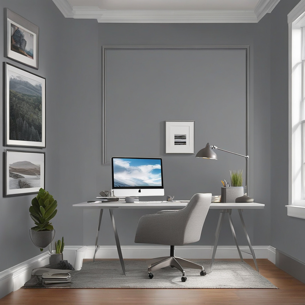
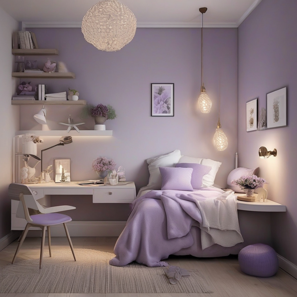
- The right colors can significantly impact bedroom serenity and office productivity.
- Professional color consultations are a valuable investment for efficient renovation.
- Select eco-friendly, high-quality materials to enhance both appearance and health benefits.
- Consider cultural and regional color implications when designing spaces in Southern California.
- Engage with seasoned designers for maximized renovation returns.
FAQ
How does color psychology influence paint choices for bedrooms?
In the world of home design, color psychology plays a crucial role. Bedrooms are intimate spaces meant for relaxation and rejuvenation. Therefore, selecting calmer, softer tones like light blues, greens, and gentle lavenders is essential. These shades are known to promote tranquility and reduce stress. In numerous renovation projects, clients found that these colors aided in better sleep quality and overall bedroom ambiance. By integrating personal style with color psychology, homeowners can create serene and restorative environments.
What are common mistakes homeowners make when choosing office paint colors?
A common pitfall in selecting office paint colors is prioritizing aesthetic appeal over functionality. Many homeowners opt for trendy colors without considering their psychological impact. Bold, vibrant hues might seem exciting but can become overwhelming and distracting over time. Instead, experts suggest energizing yet balanced shades like soft whites, greys, or light yellows. These colors foster focus and productivity without being visually oppressive. Avoiding overly dark or harsh colors can save homeowners from the tedious task of frequent repainting.
What factors should guide my paint choice for home offices?
When selecting paint for a home office, consider the room’s natural light, purpose, and your work needs. Lighting affects how colors appear, so test samples under different light conditions. Light, refreshing hues such as soft blue or mint green can enhance productivity, while warmer notes like terracotta or mustard may foster creativity. Many experts highlight the importance of integrating organizational elements like built-in storage with your color scheme for a cohesive, functional workspace. For further guidance, don’t hesitate to contact our renovation specialists.
When is it worth investing in professional color consultation?
Professional color consultation is invaluable when undertaking significant renovations or designing spaces with dual purposes, like guest room-offices. Many homeowners underestimate how color interaction across rooms affects the overall harmony of a home. Consultants bring an expert eye to select tones that not only match personal style but also function well together throughout different spaces. These professionals consider architectural elements and lighting changes, ensuring cohesive results and potentially saving money on costly repainting later. Such expertise is particularly beneficial in older homes with unique structural challenges.
How does regional climate impact color choice for bedrooms and offices?
Regional climate plays a significant role in color decisions, as it influences light and mood. In typically sunny areas like California, cooler colors such as light blues or greens work well to balance the warm, bright sunlight often streaming through windows. Such hues can create a refreshing oasis, particularly in bedroom spaces. For offices, considering the afternoon glare is essential; neutral or cool tones can prevent harsh reflections that strain the eyes. Homeowners in milder climates might lean towards warmer hues to inject coziness, especially in rooms with less natural light.
What are the cost considerations when choosing paint colors for home renovation?
Cost-wise, it’s essential to consider both paint price and labor. High-quality paints often offer better coverage, durability, and color retention, which can justify a higher upfront cost through long-term savings. While DIY painting can reduce labor expenses, it may not yield professional results, especially with complex color schemes or textured walls common in older homes. For comprehensive projects like entire home renovations, investing in experienced painters can ensure a flawless finish that enhances property value and aesthetic appeal. Factoring in these variables helps homeowners budget effectively for a successful outcome.
What are the pros and cons of using bold colors in bedrooms and offices?
Bold colors bring vibrancy and personality but have both advantages and limitations. In bedrooms, hues like deep reds or bright purples can make a dramatic impact but may disrupt sleep if too stimulating. Balancing boldness with calming elements like soft textiles or neutral accents can mitigate this risk. Offices benefit from bold colors that inspire creativity and motivation, such as bright blues or greens, yet may become overwhelming in small or poorly lit spaces. Success lies in balancing these colors with functional needs, ensuring they complement not clash with a room’s purpose.
What maintenance issues should I consider for painted bedrooms and offices?
Paint maintenance is often overlooked, yet crucial for long-lasting beauty. Bedrooms and offices are high-traffic areas where walls can easily get scuffed or stained, especially if lighter tones are selected. In real renovation experiences, washable and scrubbable paint finishes are lifesavers, providing durability without sacrificing aesthetics. Homeowners also frequently forget the importance of proper wall preparation before painting, which can impact paint adhesion and longevity. Regular touch-ups and using high-quality paints with protective sealants can extend the life of your home’s paintwork, keeping spaces fresh and inviting.