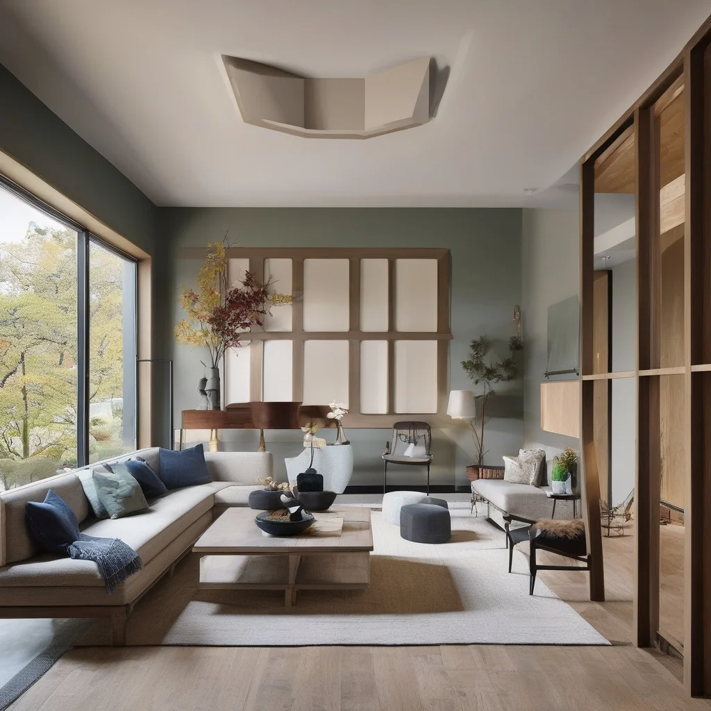
Open-plan homes promise flexibility and light, but they also create a design problem that many homeowners in Los Angeles and Southern California recognize quickly: when one room is always visible from the next, color choices no longer behave as isolated decisions. A paint tone that looks calm in the kitchen may turn muddy beside the living area, while a bold dining-wall accent may interrupt sightlines that were meant to feel expansive. The result can be subtle but persistent visual friction, where the home feels pieced together rather than composed.
Color continuity Open layouts need connected color relationships, not isolated room-by-room picks. The practical approach is to build around shared undertones and controlled contrast between zones. The main risk is choosing colors by sample-card appearance alone, which can create abrupt visual breaks under changing light. Professional assessment may help when existing finishes, unusual lighting, or surface conditions make the palette hard to judge.
That matters because color flow does more than decorate walls. It shapes how scale is perceived, how natural light travels, and how finishes such as flooring, cabinetry, trim, and stone read together. This article explains how to create room-to-room color flow in an open-plan home, what conditions should be reviewed before choosing paint, how different transition methods compare, and when it makes sense to bring in professional guidance to evaluate surface preparation, measurements, or existing material compatibility.
Why color flow becomes difficult in open-plan homes
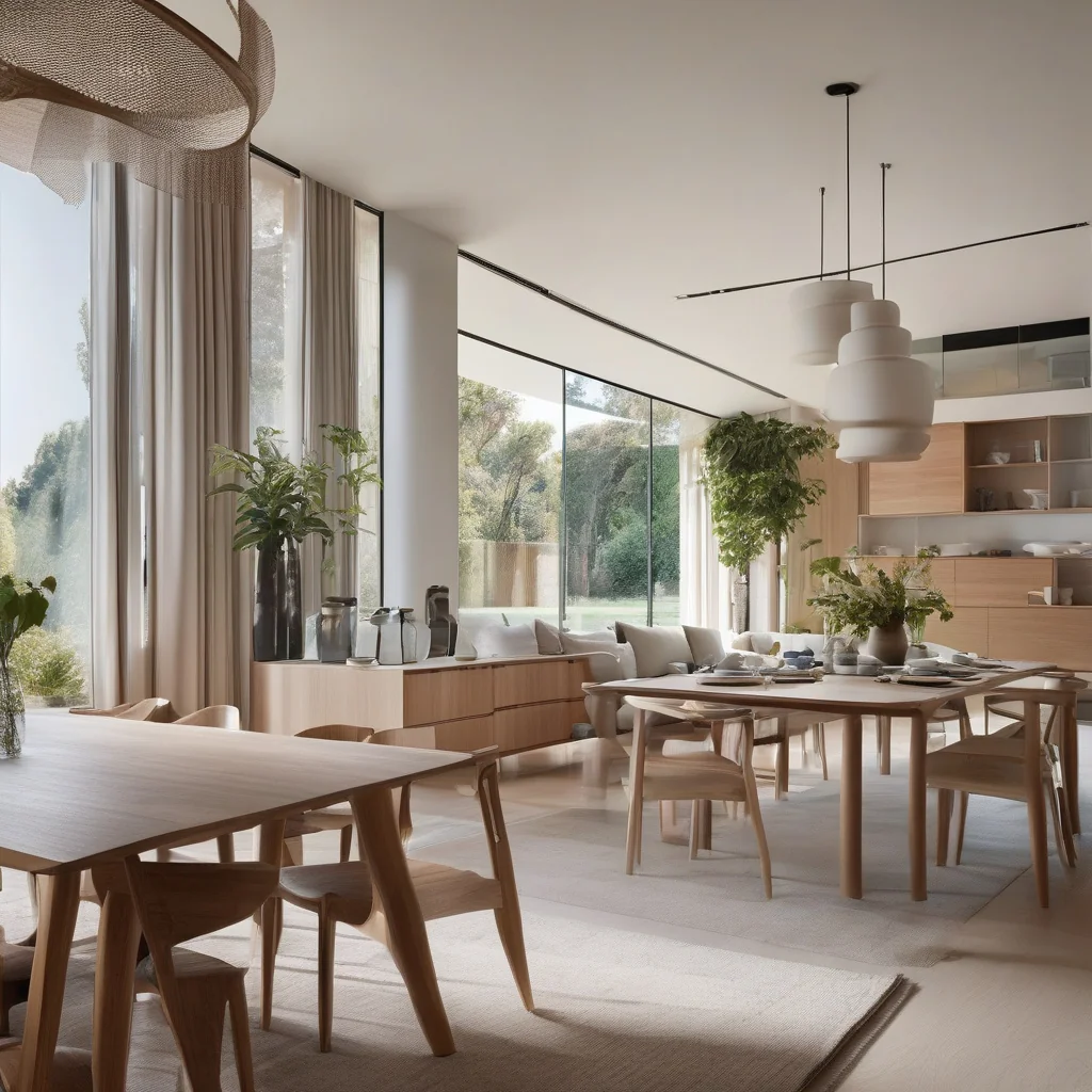
In a traditional compartmentalized house, a homeowner can treat rooms almost as separate compositions. Open plans remove those visual breaks. Kitchen walls, living areas, dining spaces, hall transitions, and stair volumes often share continuous sightlines, making every paint choice part of one larger sequence. A color may appear warmer near wood floors, cooler against stone counters, or harsher under recessed lighting. This is why open-concept painting requires more than simply picking several shades from the same family.
A homeowner may notice that the problem is not one obviously wrong color, but an accumulation of small mismatches. One beige leans pink, another cream leans yellow, and a gray-green adjoining space suddenly feels disconnected. In many homes, the correct approach begins with evaluating the whole visual field rather than focusing on one wall at a time. A useful starting point can be a broader review of interior painting approaches that ties finish selection to the shape and function of the space.
What homeowners should know before planning the palette
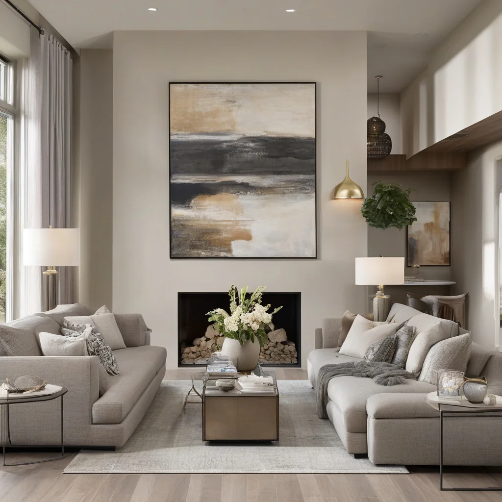
Before selecting any color family, it helps to look at the conditions that control how that color will actually read. Dimensions matter because large wall expanses intensify undertones. Ceiling height matters because deep or cool shades can visually lower overhead planes, while pale colors may flatten a dramatic volume if used without contrast. Window placement matters because north, south, east, and west exposure can shift warmth and shadow through the day. Existing finishes matter as well: flooring, tile, cabinets, counters, fireplace surrounds, and trim are often more visually dominant than homeowners expect.
This planning stage should also account for use and circulation. A kitchen-dining-living sequence may need one level of continuity, while a tucked-away office niche or reading corner may benefit from a controlled variation. If the home has patched surfaces, uneven texture, stains, or signs of moisture, appearance alone is not enough to decide the next step. Surface condition can affect color consistency and sheen reflection, and if there is uncertainty about staining, adhesion, or dampness, a closer inspection is appropriate before finalizing the finish schedule. For homeowners weighing bold contrast as part of a broader design decision, even exterior-focused discussions of black and white colors can clarify how strong value shifts influence visual structure.
Plan the palette as one connected environment first, then adjust each zone by degree rather than by contrast alone.
Another common oversight is access to all relevant viewing angles. A paint sample viewed from a single point rarely tells the full story in an open plan. This situation can occur when a homeowner stands in the kitchen and likes a color, only to later see it from the entry and discover that it fights with the adjacent hallway and stair wall. Testing should consider movement through the home, not just one static viewpoint.
How to compare the available options for room-to-room transitions
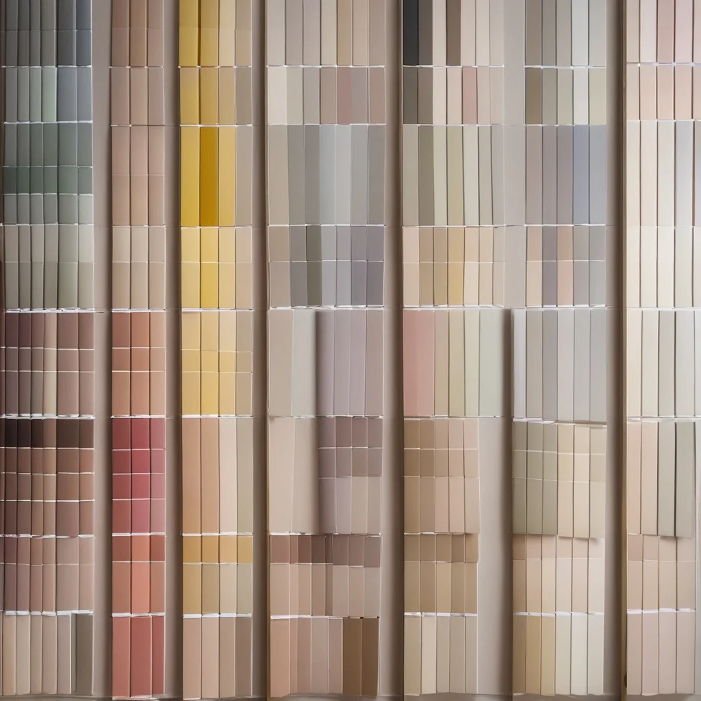
Most successful color flow strategies rely on one of four methods: a single continuous base color, tonal shifts within one undertone family, architectural breaks used as transition points, or feature zones with restrained contrast. Each method has strengths and limits. A single color creates the strongest continuity and can visually expand the space, but it may reduce definition if every area performs a different function. Tonal shifts preserve flow while giving each zone a slight identity, though they require careful control of undertones. Architectural breaks such as columns, soffits, built-ins, or recessed walls can support stronger changes, but only if those breaks are visually credible. Feature zones can work well in dining or entry moments, but only when the contrast is balanced by neighboring surfaces.
Preparation can also vary by method. A unified light palette may expose surface irregularities more clearly, making patching and priming more important. Deeper accent areas often show lap marks, texture changes, or sheen inconsistency if preparation is incomplete. Existing wall texture, trim condition, and transitions between drywall and other assemblies all influence the final effect. While discussions of exterior assemblies such as stucco vs siding belong to a different part of renovation, they underline a useful principle here as well: finish performance always depends on the substrate beneath it.
| Approach | Best Use | Advantages | Limitations |
|---|---|---|---|
| Single whole-home color | Highly open layouts with strong daylight | Maximum continuity, simple maintenance | Can feel flat if architecture lacks variation |
| Tonal family progression | Homes needing subtle zoning | Balanced personality and cohesion | Undertone mismatches are easy to miss |
| Architectural transition points | Layouts with columns, recesses, or built-ins | Clear visual logic for shifts | Weak boundaries can make changes feel arbitrary |
| Restricted accent zones | Dining walls, niches, or framed focal areas | Adds depth and emphasis | Higher risk of visual interruption |
Short-term savings often come from reducing the number of colors and finish changes. Long-term value, however, comes from choosing a strategy that still works when furniture moves, daylight shifts seasonally, or connected spaces are repurposed. A palette that depends too heavily on one temporary arrangement may not age well.
How the project should be organised
Once a general direction is established, organization becomes critical. Open-plan color work usually succeeds when choices are sequenced and documented instead of adjusted on the fly. That is especially true when multiple connected surfaces, trims, ceilings, and partial-height walls are involved.
- Define the overall goal for continuity, contrast, and zone identity.
- Assess existing walls, ceilings, trim, and fixed finishes for condition and compatibility.
- Take measurements of main wall expanses, ceiling heights, and key sightlines.
- Compare suitable color-flow methods against lighting, undertones, and room function.
- Confirm the scope by mapping where each color starts, stops, and transitions.
- Prepare the site by protecting adjacent finishes and correcting visible surface defects.
- Complete painting in a sequence that preserves clean lines and consistent coverage.
- Inspect the result from multiple viewpoints and under different lighting conditions.
That sequence may sound straightforward, but order matters. If boundary decisions are left unresolved until the work is underway, homeowners often end up revising transition lines after areas have already been coated. In open plans, those late changes can create unnecessary patching, inconsistent sheen, or visible edge corrections.
Common mistakes and project risks
Choosing by chip, not by context
The most common mistake is selecting colors from isolated samples without comparing them against the home’s permanent finishes. A homeowner may fall for a soft taupe on a sample card, only to find that beside cool flooring and white cabinetry it turns noticeably pink. In open layouts, undertone conflict is usually more disruptive than simple brightness or darkness.
Underestimating preparation and sheen
Another risk is treating color flow as a palette issue only. Surface preparation influences the final visual result just as much. Uneven texture, patched drywall, roller stipple differences, or inconsistent sheen can break continuity even when the color family is correct. This situation can occur in remodels where old and new wall sections meet, or where prior repairs were not fully feathered and primed.
Late changes are also costly in visual terms. A stronger accent added after the overall palette is approved may pull attention away from circulation paths, make ceilings feel disconnected, or overemphasize one zone at the expense of the whole plan. Ambitious contrast is not inherently wrong, but it works best when introduced deliberately and tested within the broader composition.
If a transition line feels arbitrary on the floor plan, it will usually feel even more arbitrary once the walls are painted.
What affects cost and when professional help makes sense
Project scope can expand for reasons that are not visible at the color-selection stage. Large open areas may require more extensive surface correction because continuous light exposes flaws across long walls and ceilings. Existing condition matters: stains, prior patching, texture inconsistencies, or adhesion problems can add preparation steps. Access also matters, especially in double-height spaces, stair voids, or rooms with fixed millwork that complicates cutting clean lines. Custom transitions, ceiling changes, and trim coordination can all increase complexity even when the palette itself seems restrained.
Professional help may make sense at different levels depending on the issue. A designer can help establish undertone compatibility and zone hierarchy. A painting contractor can assess substrate condition, finish sequencing, and the practical implications of sheen and coverage. If there are signs of moisture, cracking, movement, or other conditions that suggest the wall surface may not be stable, further inspection is appropriate before paint selection is finalized. Near the finishing stage, a review of primer types can be a useful next step when stains, repairs, or mixed surfaces require targeted preparation rather than a one-product approach.
Long-term results depend less on how many colors are used than on whether the surfaces, transitions, and lighting were evaluated honestly at the start.
In the end, color flow in open-plan homes is a design discipline as much as a decorating choice. The strongest results come from shared undertones, measured variation, and transition points that make architectural sense. When uncertain conditions affect the walls themselves, professional assessment can prevent a visually connected plan from being undermined by technical problems beneath the finish.
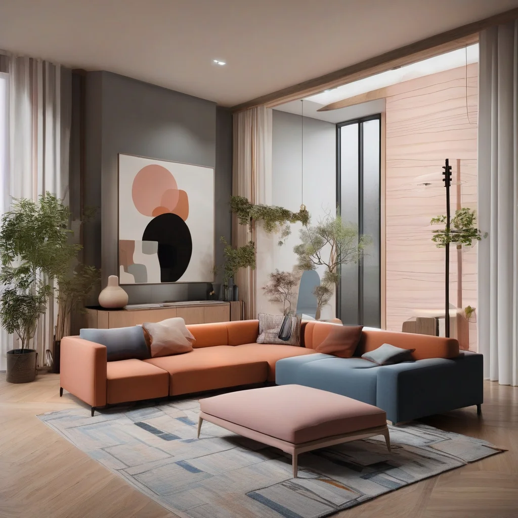
- Shared undertones create smoother room-to-room color flow.
- Test colors across sightlines, lighting changes, and fixed finishes.
- Poor prep and arbitrary transitions can raise complexity and rework.
- Seek professional input when surfaces, lighting, or existing finishes are difficult to judge.
FAQ
What is color flow in an open-plan home?
Color flow is a coordinated transition of paint, finishes, and accents from room to room that keeps open-plan spaces connected. It works best when shared undertones and repeat colors guide the whole layout.
When is it better to use one palette versus different shades?
Use one palette when rooms visually connect and you want calm continuity. Choose different shades when zones need definition. The key is keeping undertones consistent so the home feels linked, not choppy.
How do I choose colors that flow from a living room into adjoining spaces?
Start with a dominant neutral or main wall color, then repeat it through trim, textiles, or a secondary shade. Test samples in daylight and evening light, since open-concept LA interiors can read differently by room.
What are common mistakes when planning color transitions in open-plan homes?
Common mistakes are mixing undertones, using too many bold accents, and ignoring fixed finishes like flooring. Those choices can create visual breaks, while a restrained plan improves flow but may feel less expressive.
What else should homeowners consider before making a final decision?
Consider sightlines, existing materials, and how much contrast each zone needs. If the layout is complex or finishes vary widely, a professional assessment can help avoid mismatched transitions. For tailored guidance, contact our team before committing.